Formiture
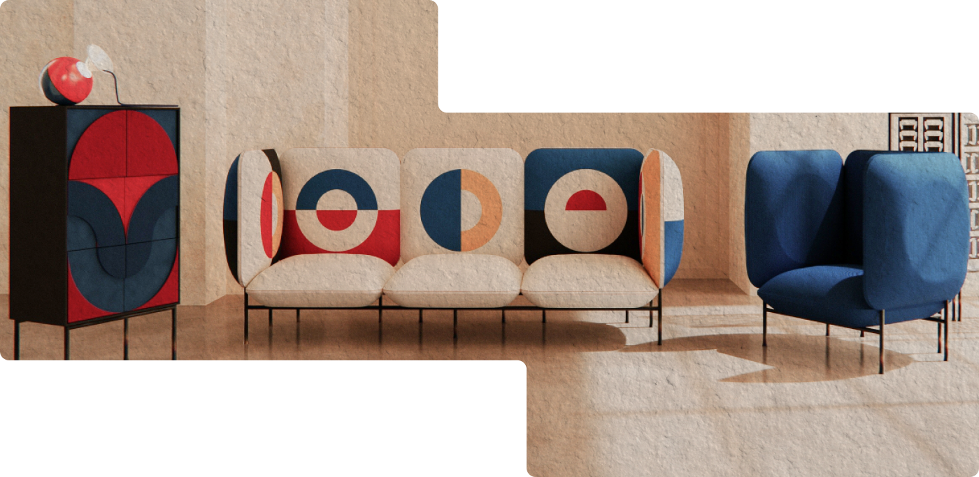
A furniture shop for people who compare before they buy, with a checkout that shows one step at a time.
3 buyers, 3 reasons to buy
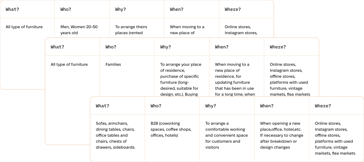
A 5W breakdown — who, what, where, when, why — sorted the market into 3 customer groups, then persona work turned those groups into people with needs, values and goals.
Individuals
- Adults aged 20–50 furnishing a rented or newly bought place. They shop online and on Instagram across all furniture categories.
Families
- Furnishing a new home or replacing pieces that have been in use a long time. They buy long-desired, specific items — and look at offline stores, marketplaces and flea markets as well as online.
Businesses
- Coworking spaces, coffee shops, offices and hotels fitting out a comfortable working space for staff and visitors. They buy sofas, armchairs, dining tables, office tables and chairs, chests of drawers and sideboards.
Categories and filters decide what gets found
I defined 3 buyer groups and what each needed before making a purchase, then compared competitors to separate essential features from useful differentiators. The personas guided where product details, delivery and return policies appeared on the product page.
- 01
3 buyers, 3 reasons to buy: businesses want comfort at scale; families buy when they move or refresh a room; individuals choose for style and durability.
- 02
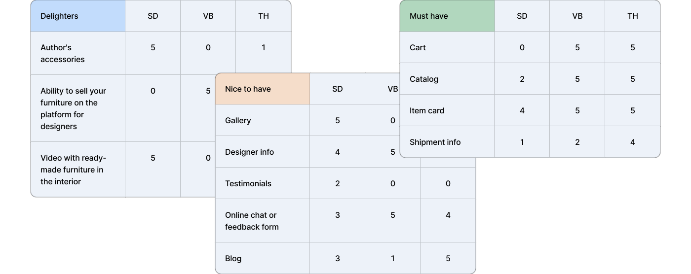
Rival sites all cover the same basics — cart, catalogue, product card, delivery details. What sets one apart are the extras: the designer’s story, a project gallery, accessories made in-house.
- 03
Testing flagged one real risk: people can stall mid-search if the categories and filters sit in the wrong place — most of all when they arrive hunting one specific type of furniture.
6 weeks from brief to tested handoff
- Briefing — goals, budget and the sections the studio needed
- Target audience — a 5W breakdown, 3 buyer groups, 2 personas
- Competitor analysis — must-have vs nice-to-have, plus a Nielsen heuristic pass
- Sitemap — the full site structure
- User flow — entry, browsing and the path to a finished order
- Wireframes — lo-fi sketches, then hi-fi screens for every page
- Usability testing — moderated and offline, on the linked prototype
- Moodboard — direction, type pairing and palette
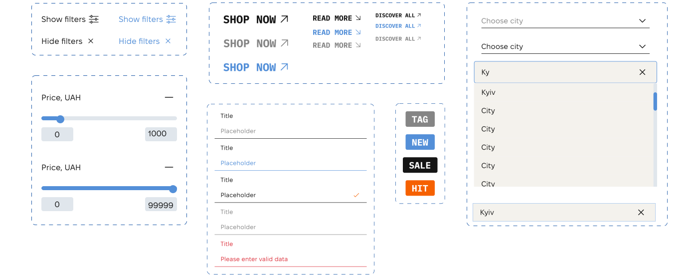
- UI kit — filters, sliders, product tags, form states
- UI design — landing, catalogue, product page, checkout, sign-in
- Prototyping — the whole purchase path linked end to end
Must-haves were not enough to stand out
I compared 3 competitors across must-haves, useful extras and standout features. This showed what every store needed and where Formiture could be different.
Risks to fix before development
A Nielsen heuristic review surfaced the risks worth fixing before development, each scored by severity.
| Severity | Visibility of system status | Match between system and the real world | User control and freedom | Consistency and standards | Error prevention | Recognition rather than recall | Flexibility and efficiency of use | Aesthetic and minimalist design | Help users recognize, diagnose and recover from errors | Help and documentation |
|---|---|---|---|---|---|---|---|---|---|---|
| High | 1 high | 1 high | 2 high | |||||||
| Medium | 1 medium | 1 medium | 1 medium | 1 medium | ||||||
| Low | 1 low | 1 low | ||||||||
| 2 · critical | 1 · minor | 1 · minor | 2 · critical | 1 · minor | 0 · clean | 1 · minor | 0 · clean | 2 · critical | 0 · clean |
The path from entry to checkout
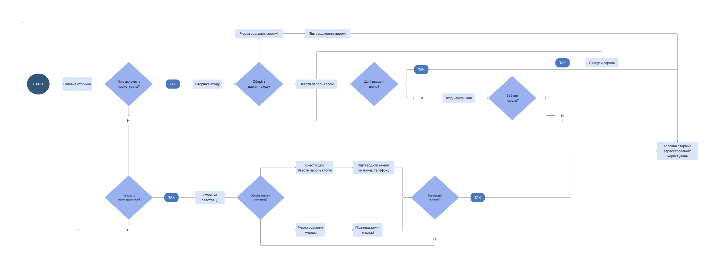
I mapped every step from landing on the site to finding furniture and completing an order, so the navigation had a clear job at each point.
The structure behind every page
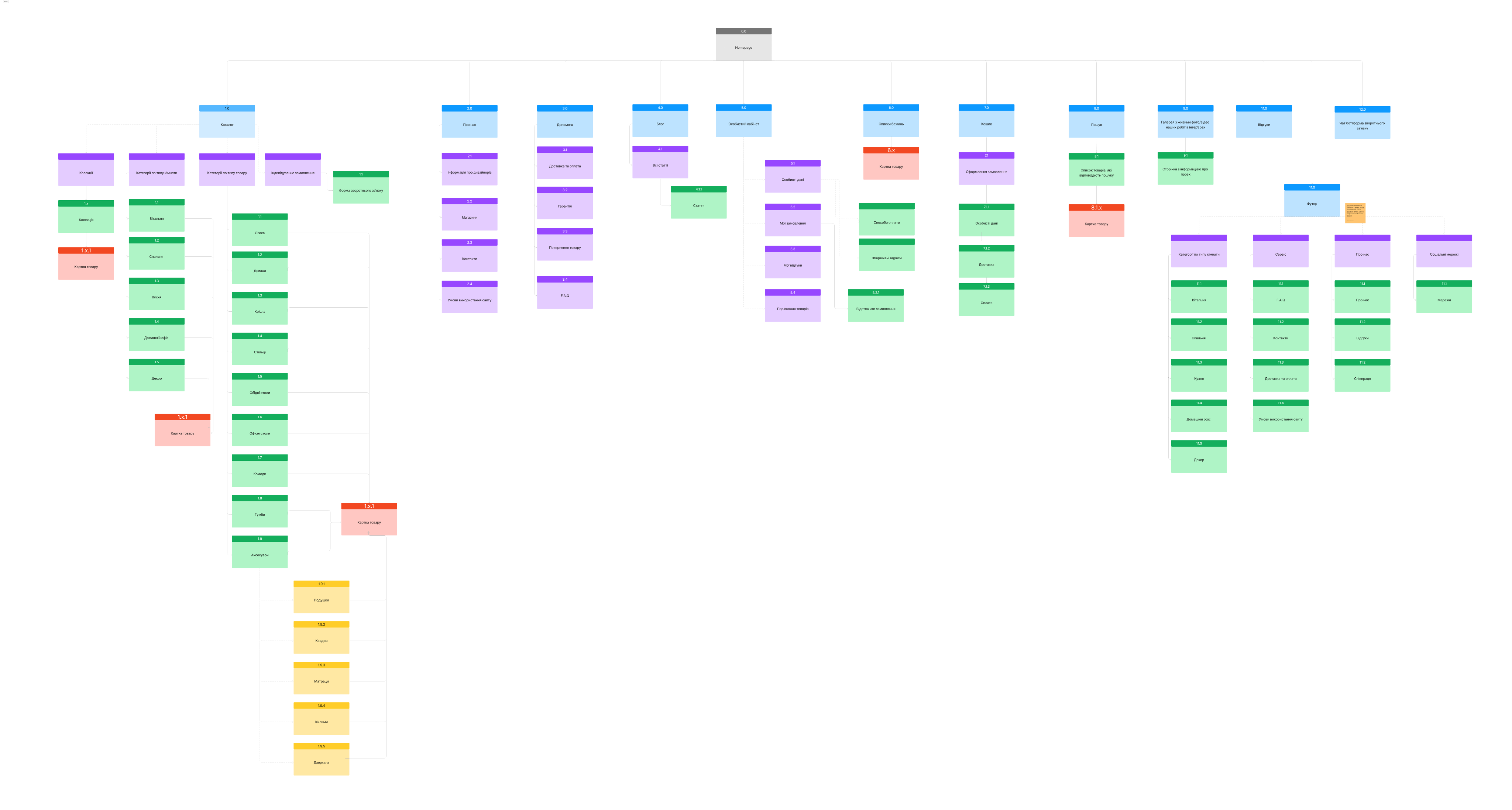
Every section and page of the site, plus the routes a visitor has between them — the structure the catalogue, the product page and the checkout were all drawn against.
Structure came before colour
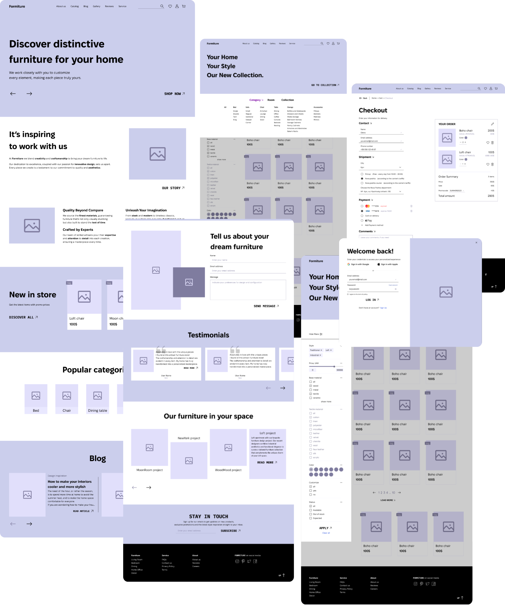
Hi-fi wireframes for every page — a realistic enough preview that stakeholders could judge the structure and settle it before a single decision about colour.
Testing exposed search friction
A moderated walkthrough checked whether a first-time visitor could find one specific chair and finish the order.
- The task
Find a Boho chair, add it to the cart, check out and confirm the order.
- The hypothesis
People may struggle to find a specific furniture type if categories are unclear and filters are too limited.
- The measures
Steps to order and post-task satisfaction.
Classic craft, modern storefront
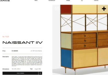
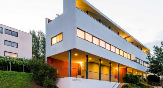
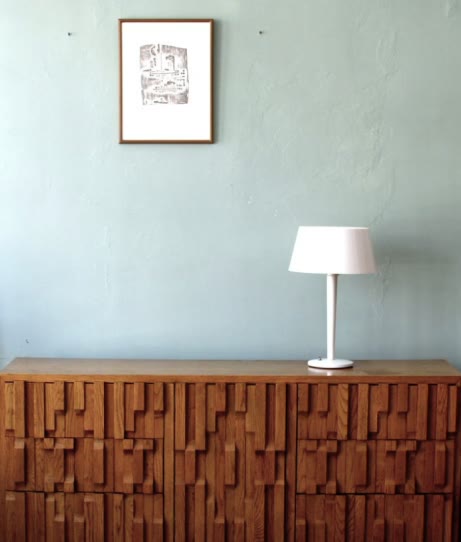
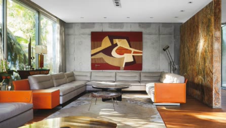
I paired classic craft with a modern storefront: minimal layouts, geometric type, strong contrast and large product photography.





Technical headings, legible specs
IBM Plex Mono is technical and geometric, so it carries the headings. Fixel Display reads well at small sizes, which is what specs and product information need, so it carries the body.

A short palette lets products lead
2 grounds and 2 accents — the whole palette, kept deliberately short so product photography carries the colour.
- #151515 Text and dark ground — the contrast the product information is read against
- #F4F2ED The paper the catalogue sits on
- #538FD8 The primary interactive accent
- #F66100 Highlights — the moments that have to be noticed
Built once, reused across the store
Filters, price ranges, buttons and links in every state, form fields with validation, tags and the city picker — built once and reused across the catalogue, product page and checkout.
3 decisions shaped the prototype
A moderated, in-person walkthrough used the hi-fi prototype. Audience: adults aged 20–50. Task: find a Boho chair, add it to the cart, check out and confirm the order. Measures: steps to order and post-task satisfaction. The participant count was not documented.
- 01
BeforeCheckout as 1 long form
After3 steps — contact, shipping, payment — each folding into a short summary
WhyOpening one step at a time takes the pressure off and the folded summaries let buyers double-check what they entered without scrolling back through every field.
- 02
BeforeCatalogue as 1 flat product grid
AfterCategory tabs with sidebar filters — style, price, material, colour
WhyThe audit showed that finding things fast was the basic to nail; tabs and filters let people browse by what they came for instead of facing every product at once.
- 03
BeforeEmail and password only at sign-in
AfterGoogle and Apple sign-in alongside email
WhyOne-tap sign-in saves returning buyers from making another account — a small extra the competitor audit flagged as worth matching.
Tested before development
Delivered as a responsive Figma file: sitemap, flows, hi-fi wireframes, UI kit and linked prototype. Components are named for handoff — product cards, filter sidebar, checkout accordion sections and PDP tabs — so a front-end pass could map each block to a reusable pattern.
A moderated walkthrough exposed category and filter friction before development; no post-change metric was recorded.
Browse to checkout, end to end
A tested browse-to-checkout prototype
- Homepage to order confirmation A linked Figma flow from the homepage to order confirmation: catalogue with sidebar filters, a product page that switches variants with delivery and returns in view, the folding checkout and sign-in screens. The walkthroughs above are that flow running end to end.
- Category and filter friction surfaced early A moderated test revealed where categories and filters could derail a specific-item search before development.
What I learned
- A competitor audit earns its keep when it separates the basics everyone needs from the extras that make a studio memorable — the basics set the floor, the extras tell the story.
- A checkout that opens one step at a time respects how slowly people commit to furniture; the short summaries let them trust what they entered without re-reading every field.