Keycall
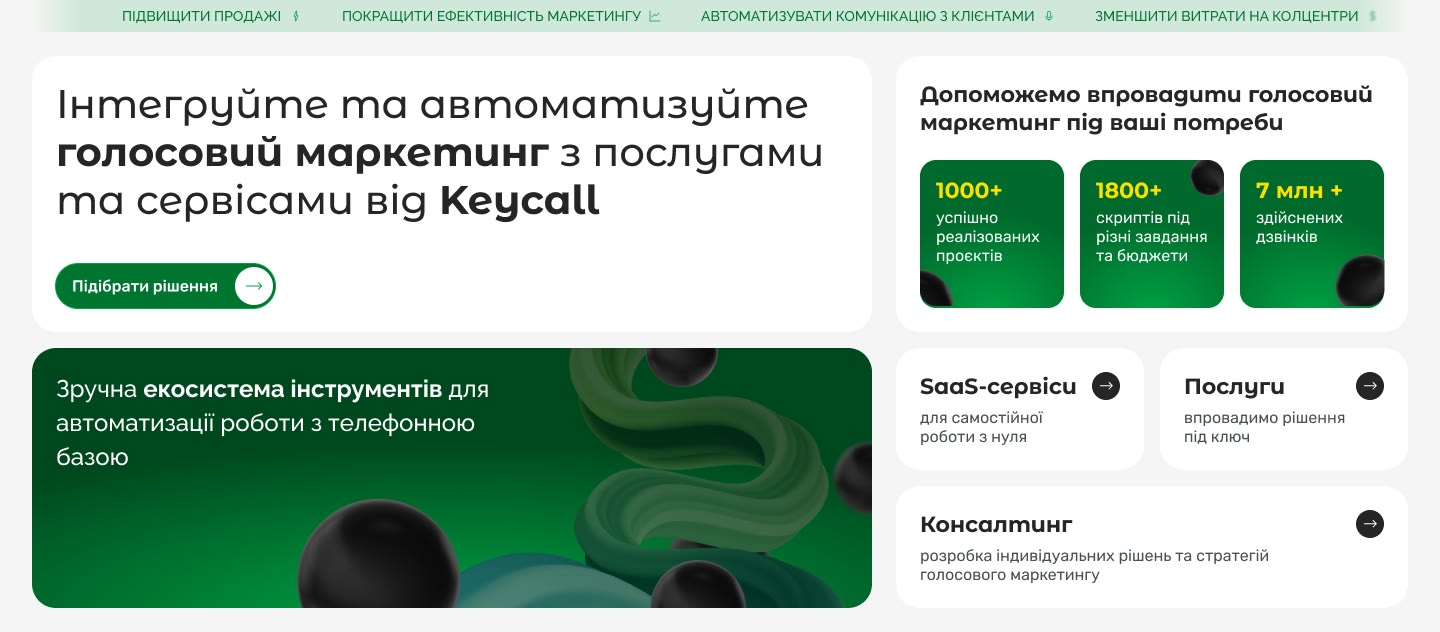
A marketing site for voice AI, auto-dialling and IVR, built around real call recordings.
See it live
The brief supplied structure and proof
The client supplied the structure, copy and proof. There was no discovery research, so this case focuses on responsive layout, visual craft and the design system.
- 01
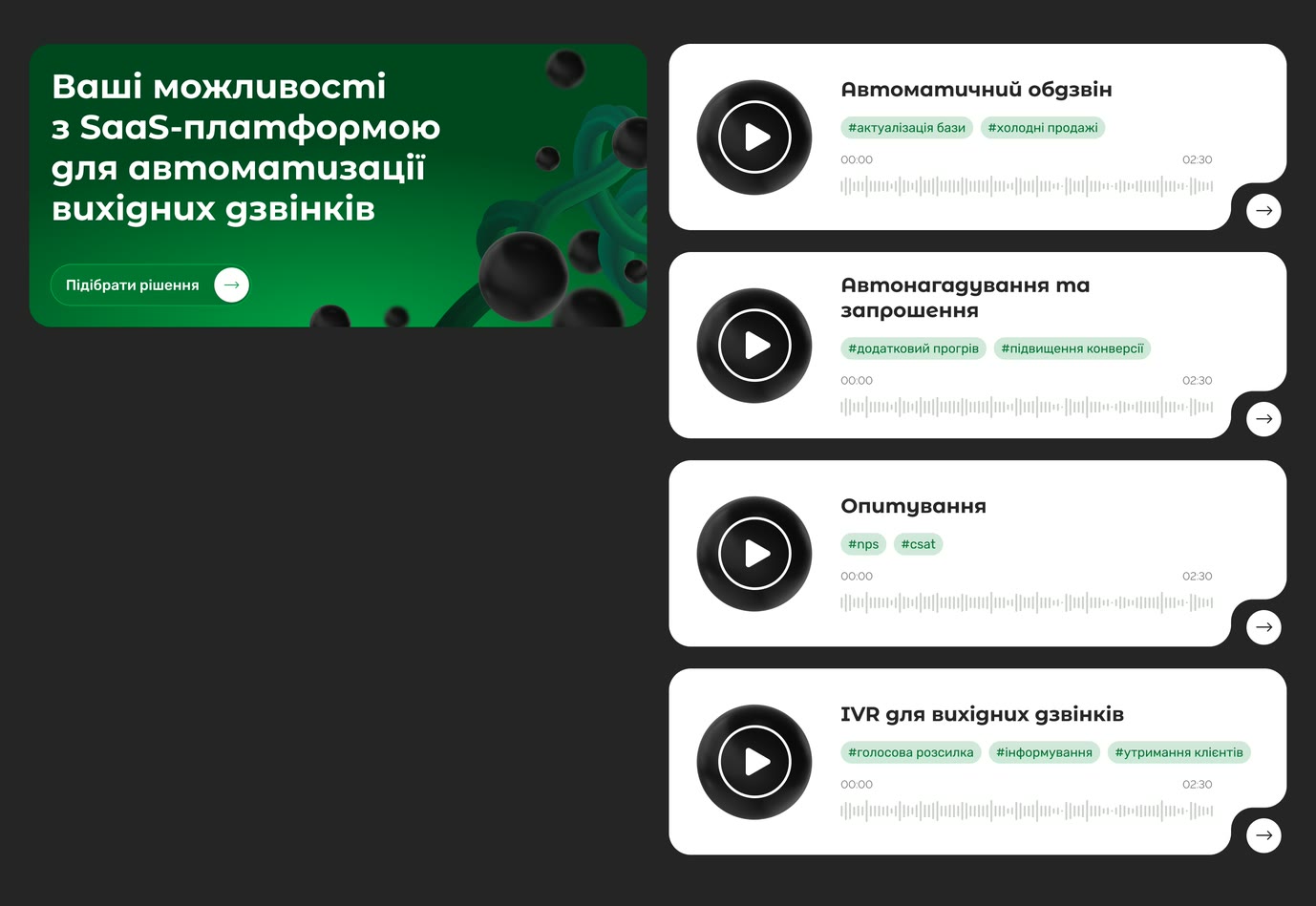
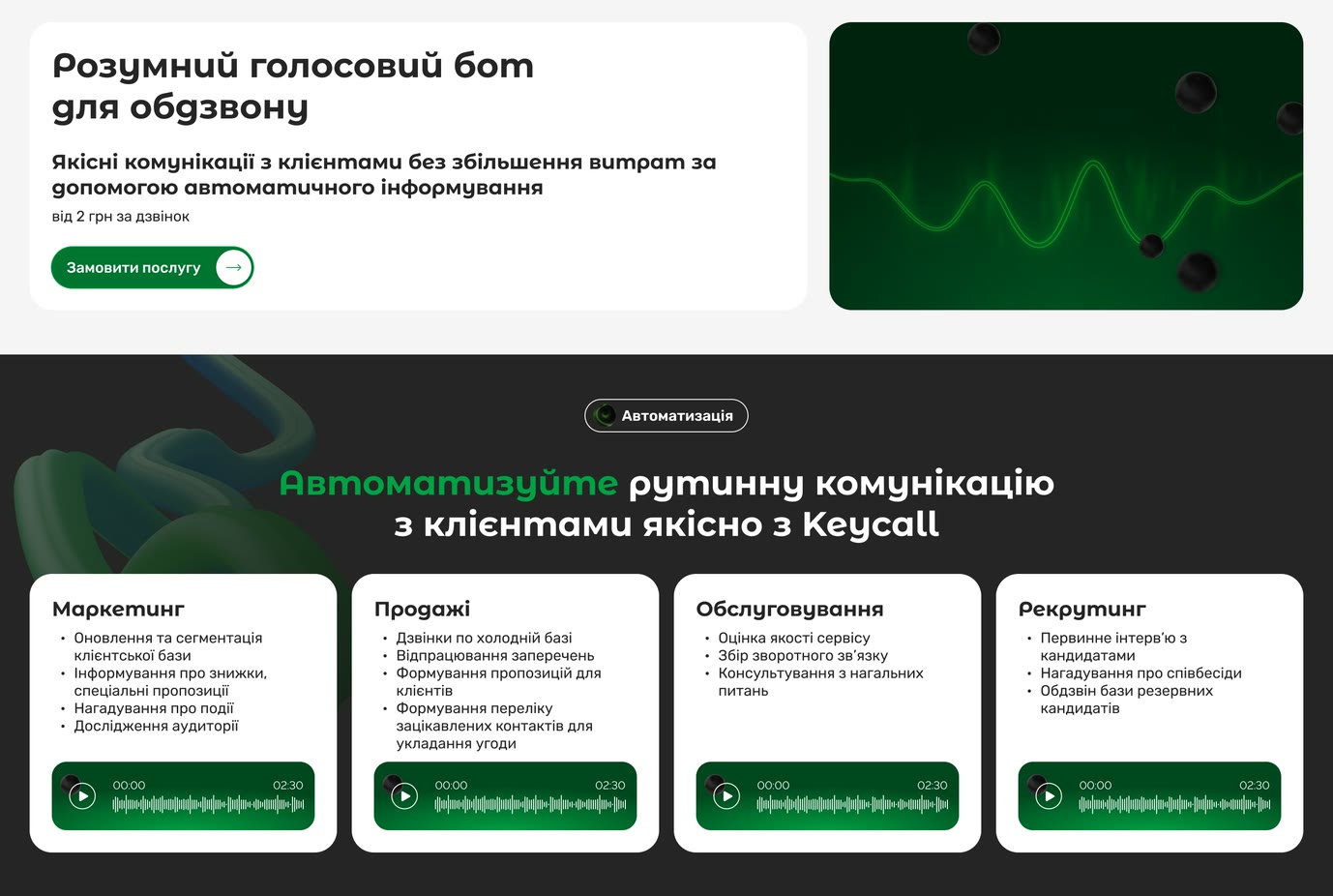
A real recording is better proof than a claim about a phone call. Each capability card includes a player, waveform and runtime.
- 02
Each capability serves a distinct buying intent, so each received its own page rather than a tab.
- 03
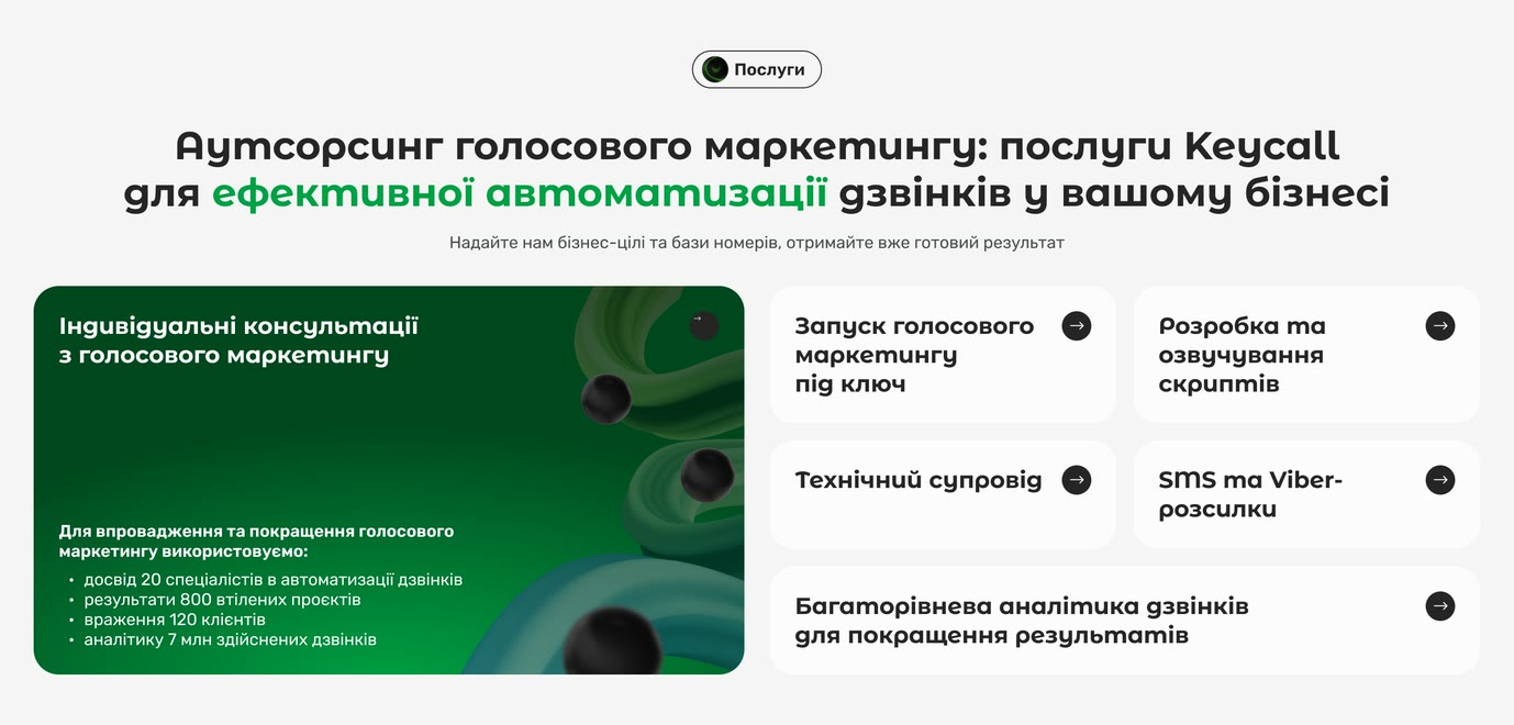
3 buying routes share the first screen: self-serve platform, managed service and consulting. Each buyer can find the right route without scrolling.
- 04
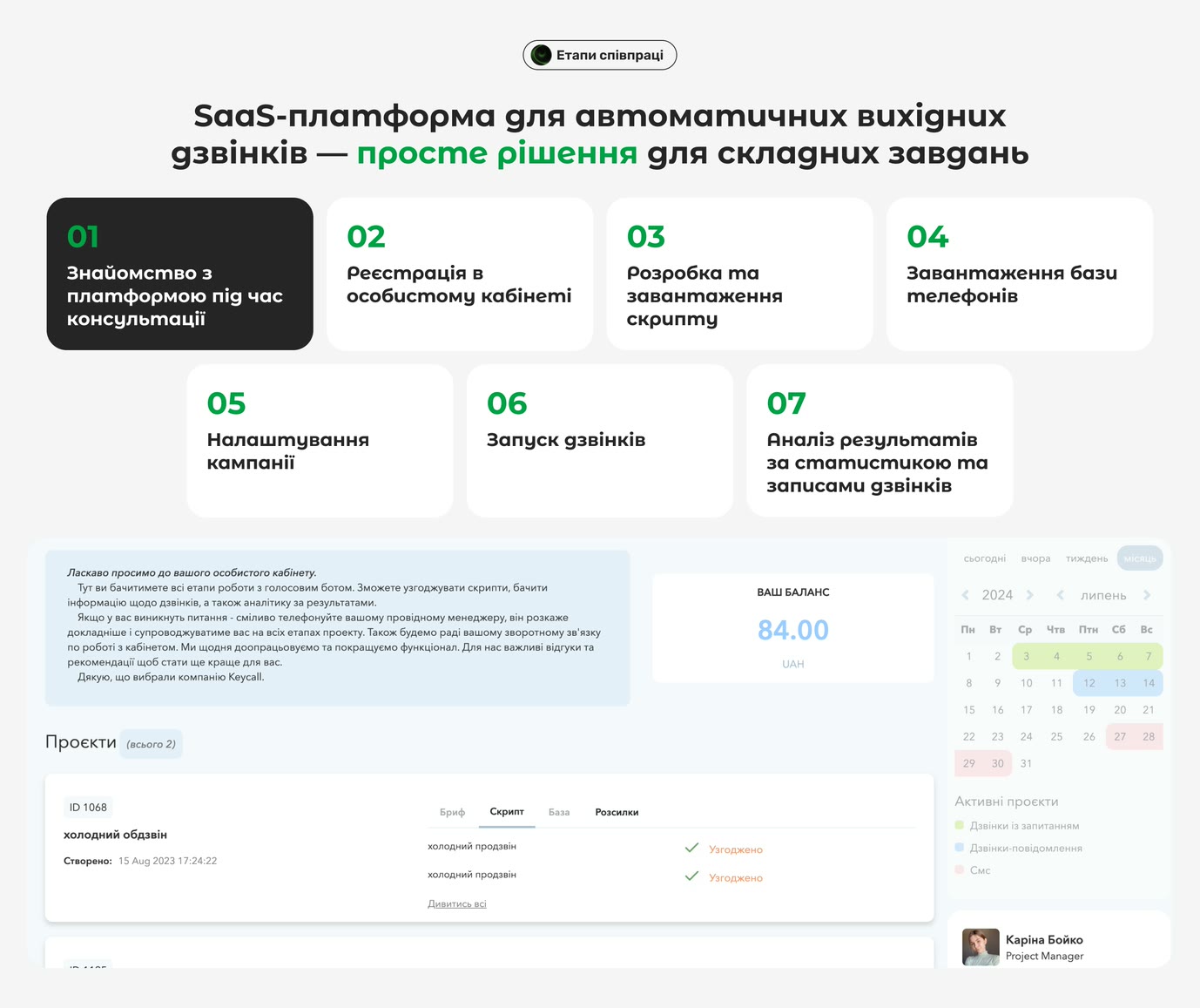
The client dashboard is the only real interface in the product, so it earns a full-width screenshot rather than a feature list.
- 05
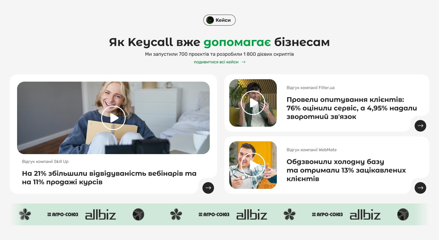
Proof in this market is a named client with a number attached — Skill Up, Filter.ua and WebMate carry the cases, while robota.ua, dev.ua, delo.ua and Speka carry the coverage.
5 page types, 3 breakpoints, 1 system
- Pages — home, voice bot, IVR, self-serve platform and outsourced service
- Breakpoints — desktop, tablet and mobile
- Design system — 52 tokens across 4 collections
- Components — bento grid, cards, chips, player cards, 2 button variants and a notched arrow button
- Shared sections — navigation, trust strip and footer reused across the site
- Accessibility — checked text contrast against WCAG AA requirements
A brand for an invisible service
The logo is a K cut out of a circle. The 3D renders take that circle out of the wordmark and give it a body: the black spheres running through every page are the mark itself, repeated at different sizes and depths.
The green ribbons around them are the line — the signal a call travels on. 2 elements, both taken from the identity, do all of the decorative work, which is how a product with nothing to photograph still looks like itself across 5 pages.



A darker green avoided a repaint
The brand green is a display colour. At 37px it is confident. At 14px on porcelain it measures 3.12:1, under the 4.5:1 small text needs, and on the pale-green chip it falls to 2.63.
The file gained a second green instead of a full repaint. A darker value clears AA on white, porcelain and the chip; the bright green stays on large headlines.
- #00A144 The brand green, kept to display sizes where its 3.12:1 on porcelain is allowed
- #007531 The second green — every small label and button fill, dark enough to clear AA on all 3 grounds
- #D0E8DA The chip tint — the pale ground the darker green also had to clear
- #252525 Ink, for headings and reading text
- #707070 Secondary text, a step down from the ink without leaving the grey
- #F5F5F5 Porcelain — the ground under the reading sections, against the dark boards that hold the sound
- #FDE100 Yellow, reserved for the numbers on the scale so it never becomes a second brand colour
Components use roles, not raw colours
4 collections hold 52 tokens. Primitives store the raw values; semantic aliases name their roles — background, text, icon, action and surface. That let the colour fix move through all 5 pages with a single alias change.
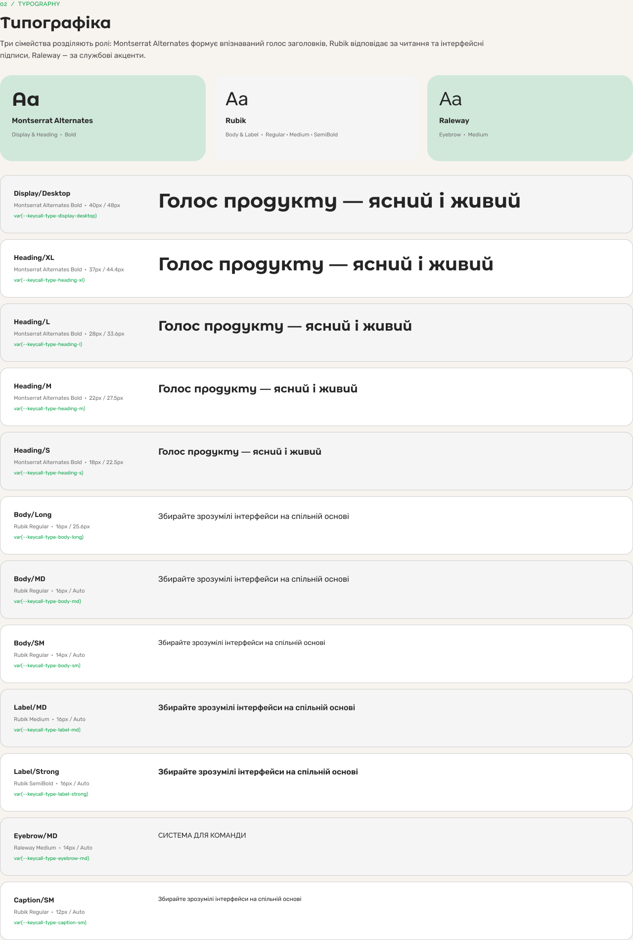
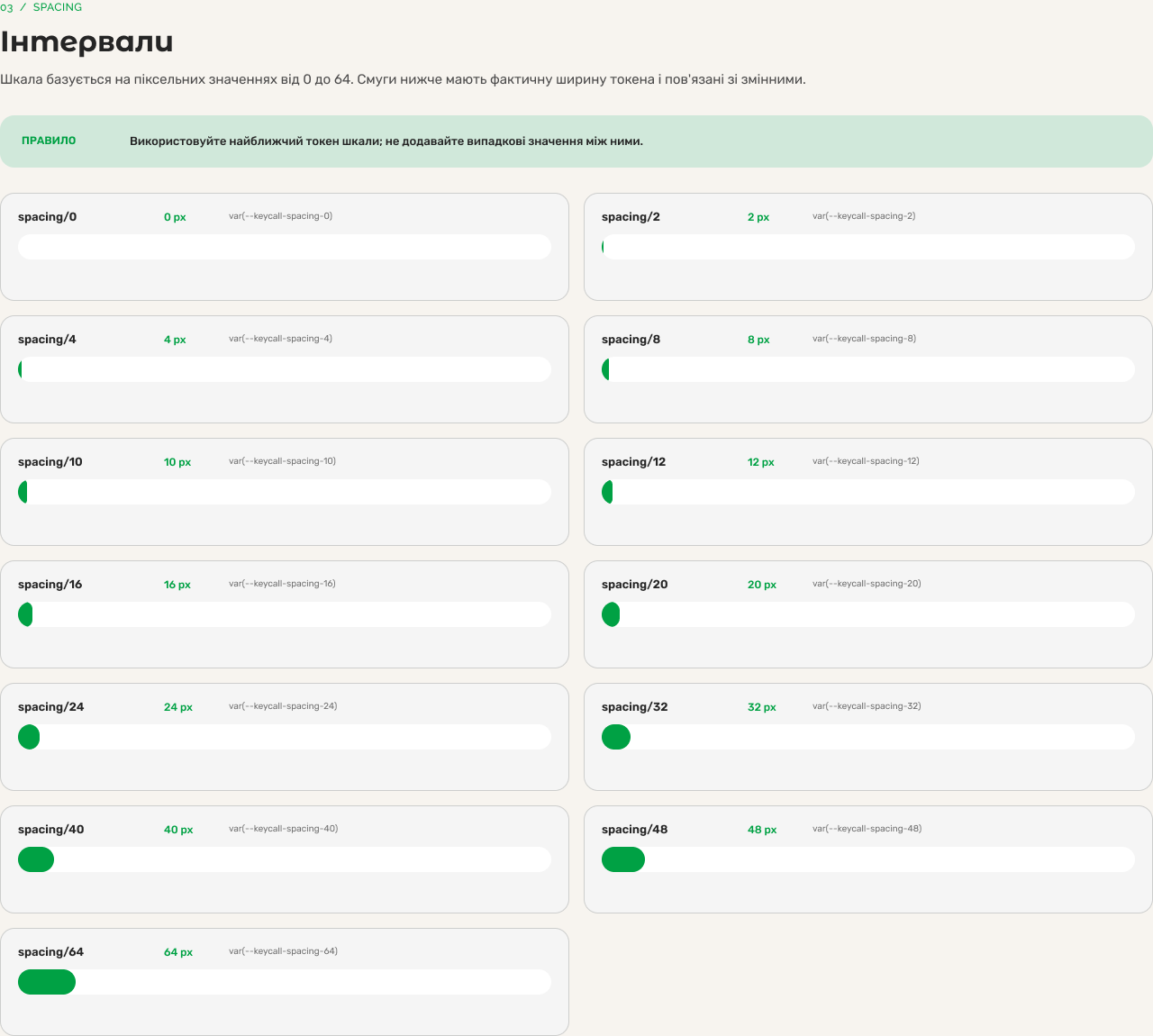
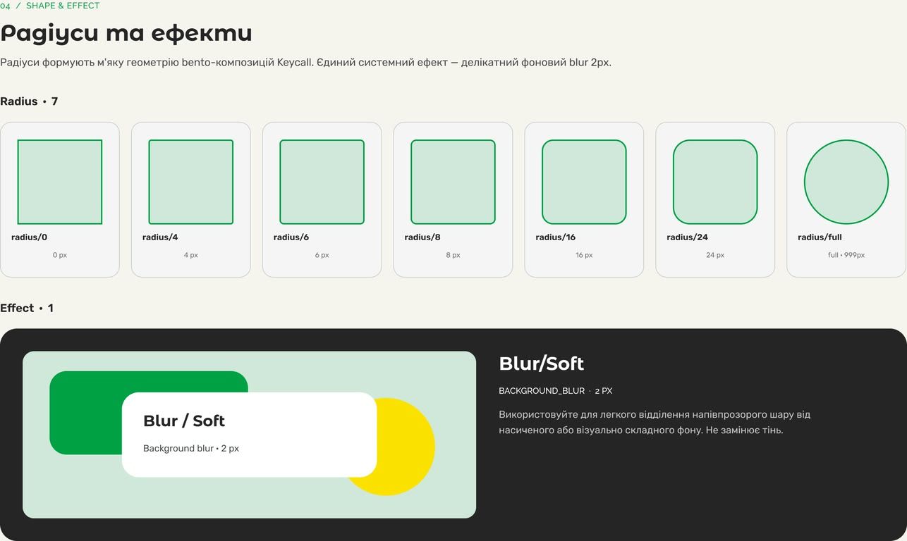
3 type families divide the work: Montserrat Alternates for display, Rubik for reading and Raleway for labels. The system includes 12 text styles, 13 spacing steps, 7 radii and 1 effect.
Listen, see proof, choose a route
- 01 Land on a capability
- 02 Hear what it sounds like
- 03 See who already runs it
- 04 Pick a way to buy
- 05 Book the walkthrough
2 fixes resolved contrast and balance
There was no participant testing. I checked text contrast, each tap target against 44px and every asset for placeholders.
- 01
BeforeThe brand green used as small text on light surfaces
AfterA second green solved for AA
Why1 extra paint style rather than a repaint: the display green keeps the headlines, the darker sibling takes every small label and button fill.
- 02
BeforeA left column pinned to the top of a 896px row
AfterThe card centred against the stack it sits beside
Why1 card beside 4 stacked cards left 590px of empty space. Centring it created a deliberate composition without adding elements.
Real calls make the product visible
Live at k-call.com
- Reusable call-player cards Each card combines a recording, waveform, runtime and job tags, making a real call visible on the page.
- It shipped Live at k-call.com.