The Clay
A pottery studio site that explains the experience, shows prices and books classes by date.
First-time makers need the experience explained
Adults who want to make something with an experienced potter and discover what pottery feels like.
People book the experience, not the pot
I found 3 common booking barriers across competing studios: prices hidden behind a form, dates available only by message and no clear picture of what a class involves.
- 01
People book a class to make something themselves, not to own a finished pot — the page has to sell the evening, not the object.
- 02
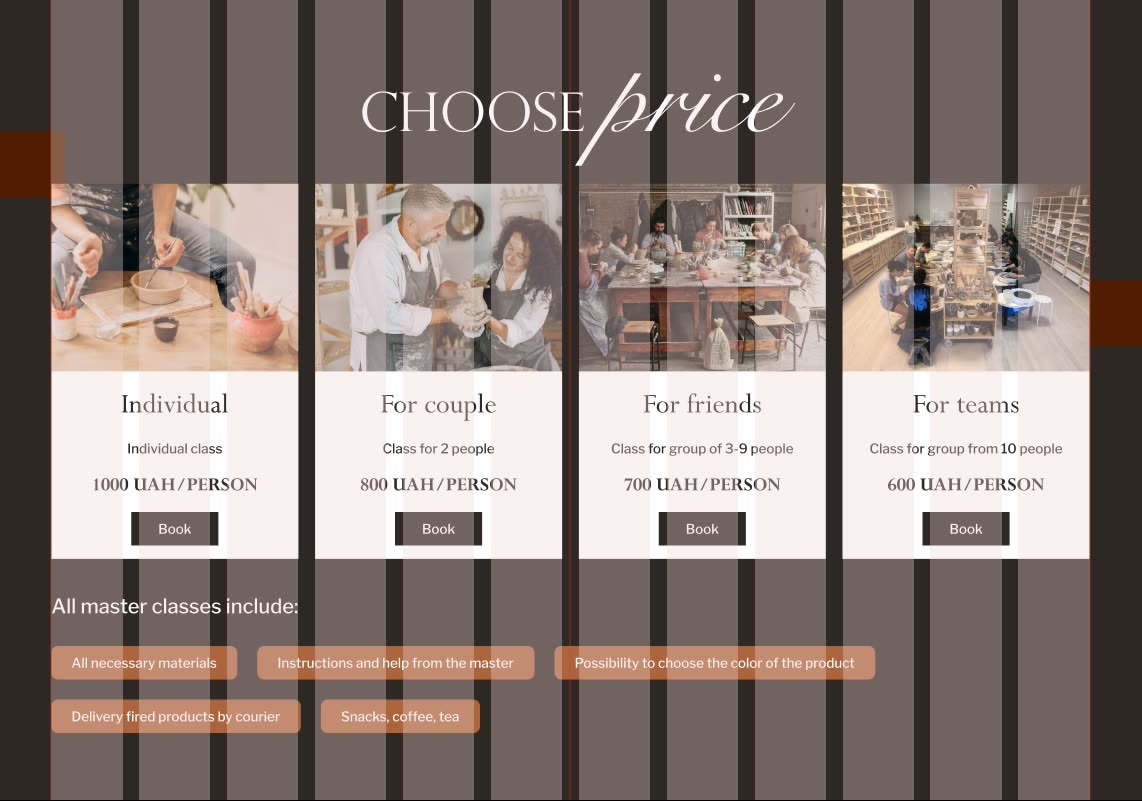
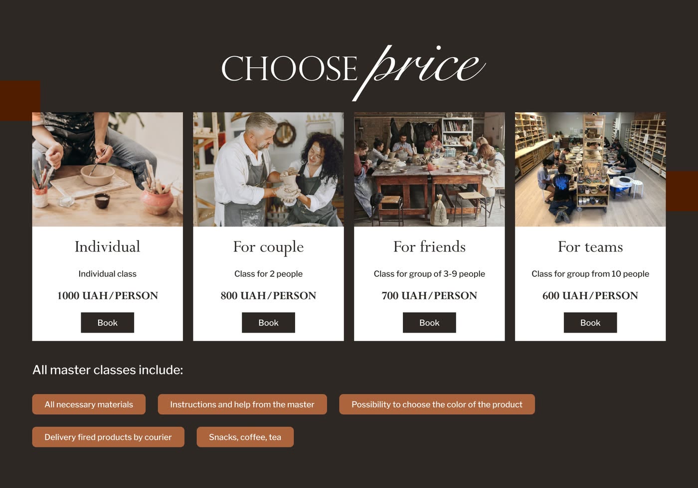
Visible prices remove a major booking barrier. Individual, couple, group and team rates sit on the page, so nobody has to ask first.
- 03
Nobody books a date they cannot see. Showing the classes running on a chosen day turns browsing into a decision.
From studio story to booking handoff
- Competitor audit — prices, dates and class expectations across comparable studio sites
- Page structure — studio story, audience, prices, proof, FAQ and 1 booking action
- Visual system — photo-led layout, clay palette, type and reusable interface states
- Responsive UI — the full landing page on a 12-column grid
- Booking prototype — date selection, class choice, details, payment and confirmation
- Handoff — component variants and a linked responsive Figma file
3 angles on the idea
I checked what could attract visitors, what the studio could run and what could go wrong. The strongest ideas were upcoming-class listings plus real photos, video and reviews.
Key ideas
- Add a section with the next masterclasses
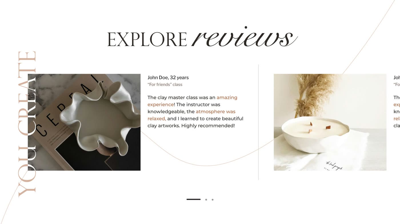
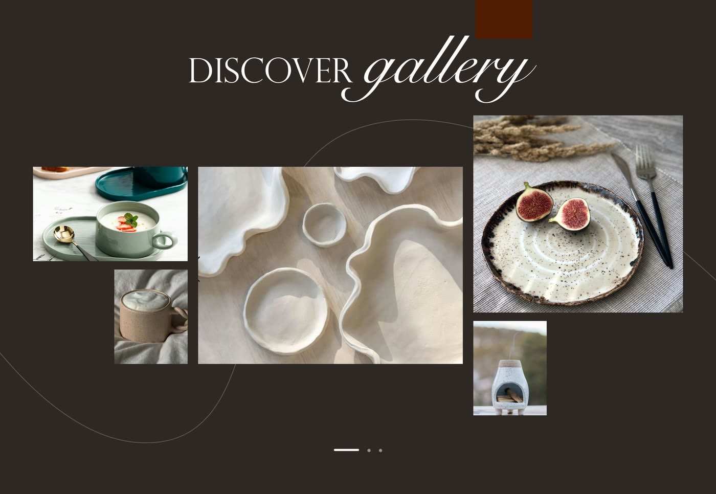
- Add video and photos from the masterclasses themselves, with real feedback from the people who came
12 columns kept the page aligned
The 12-column grid kept each photo-led section aligned without making the layout rigid.
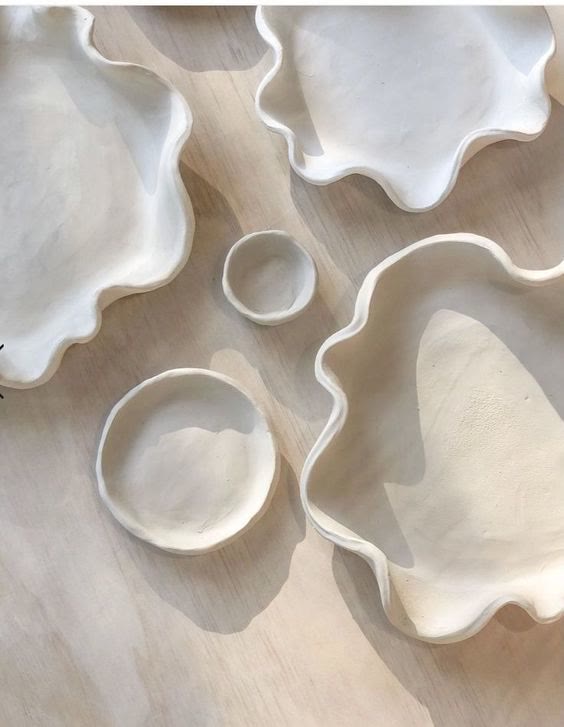
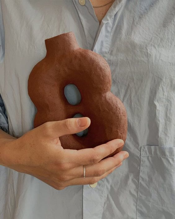
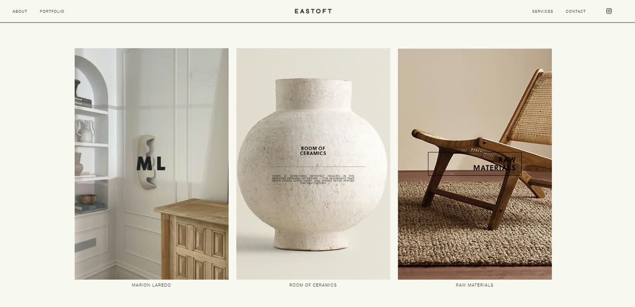
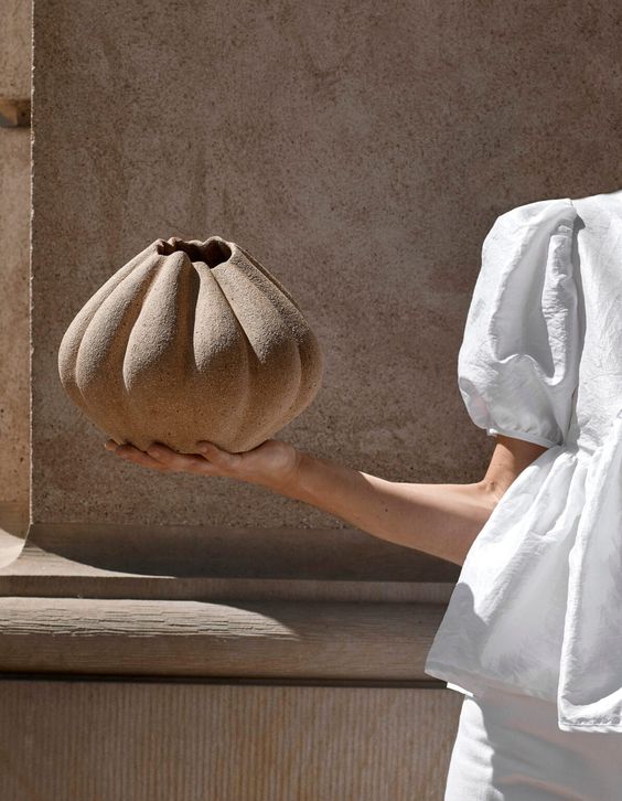
Nothing competes with the ceramics
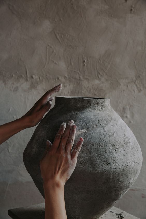
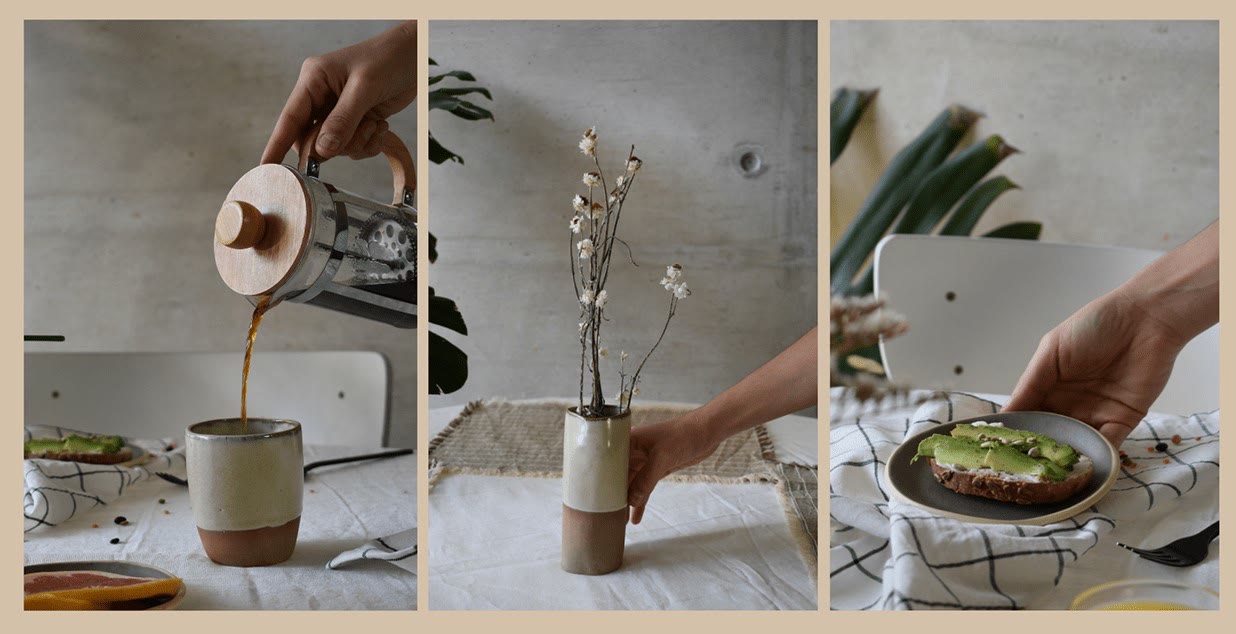
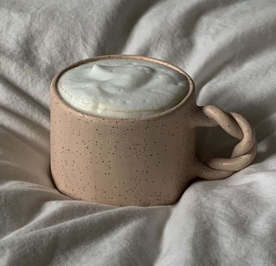
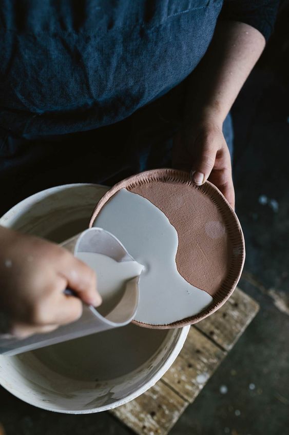
Minimalism, so nothing competes with the ceramics: clay and terracotta neutrals, generous space around every element, no chrome asking to be looked at.
- #2E2725 Clay itself and the natural materials pottery is made from
- #423739 The second ground tone, for depth without going black
- #AC643E Highlights the main elements on the landing page
- #E3DAC9 Beige, for softness
- #FFFFFF White, for the space around everything else
Modern UI, classic craft
Libre Franklin keeps interface text clear; Perpetua gives headings a traditional craft feel; Snell Roundhand is used only for script accents.

Ceramics carry the colour
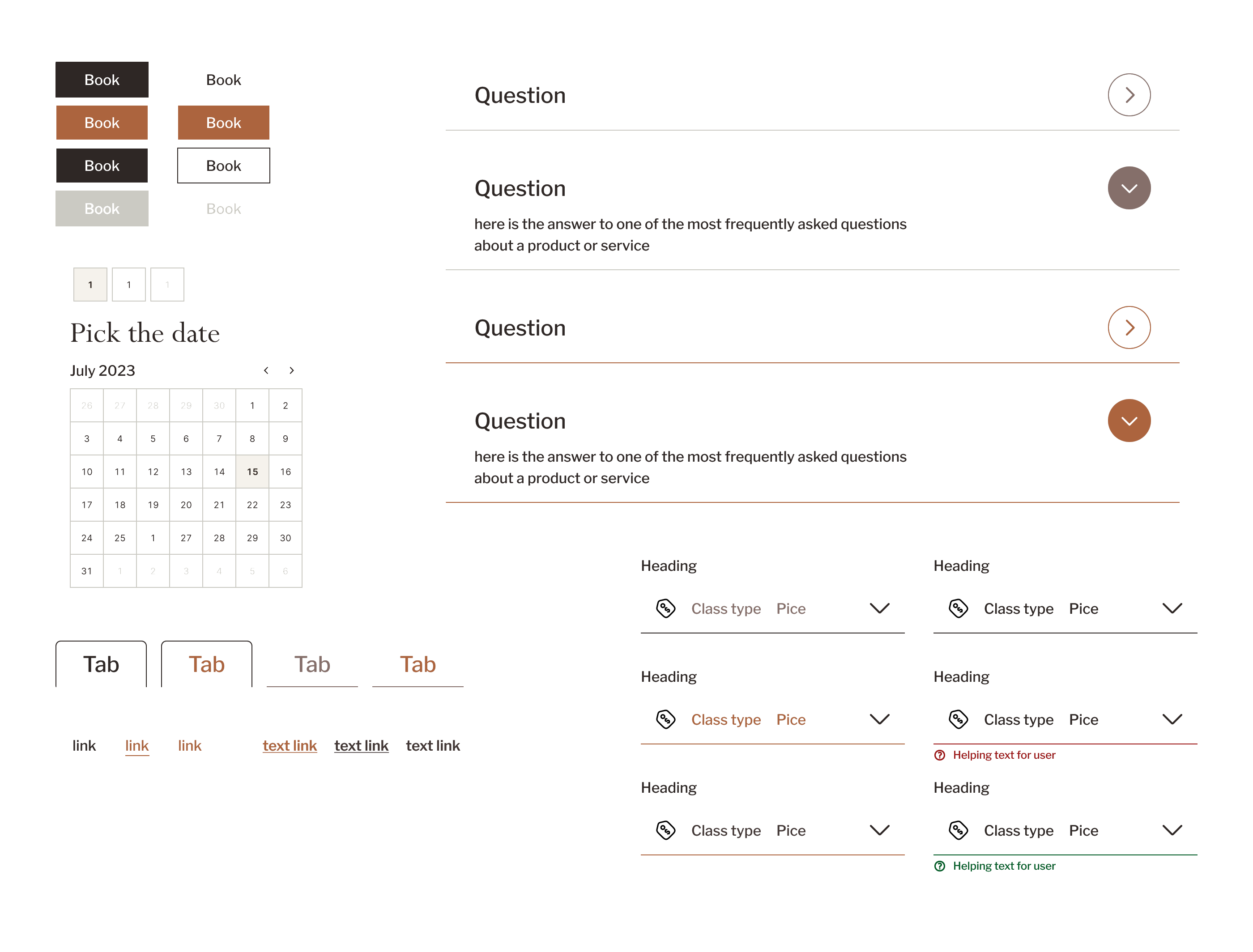
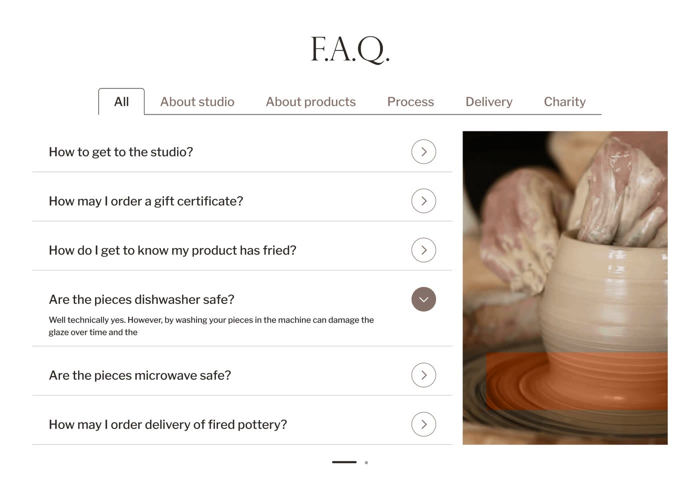
Buttons, tabs, the calendar, links, the FAQ rows and every form state — sized for large photography and kept quiet, so glaze and texture carry the colour and the chrome does not.
3 decisions shaped the booking experience
I reviewed the linked prototype against 3 criteria: studio credibility within 10 seconds, clear prices and a complete date-to-confirmation path. This was a design review, not participant testing.
- 01
BeforeHero leading with class listings
AfterHero leading with studio photography and a single Book class CTA
WhyThe schedule arrived before trust; leading with the studio fixed the emotional sequence.
- 02
BeforeCool grey booking-tool palette
AfterClay-toned warm neutrals
WhyCool greys read clinical; warm clay tones match the material.
- 03
BeforeMultiple competing CTAs above the fold
After1 “Book class” button, with the studio story as the secondary link
WhyCompeting buttons split attention on a landing that only needs one first move.
Studio story to booking confirmation
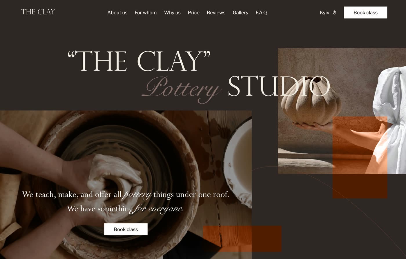

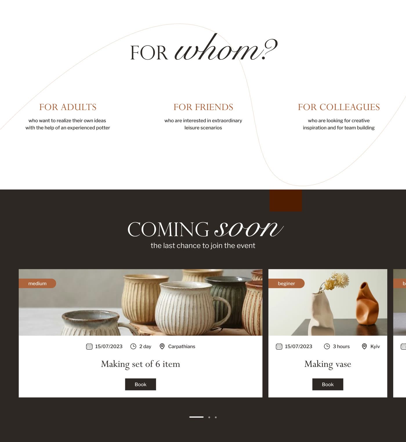
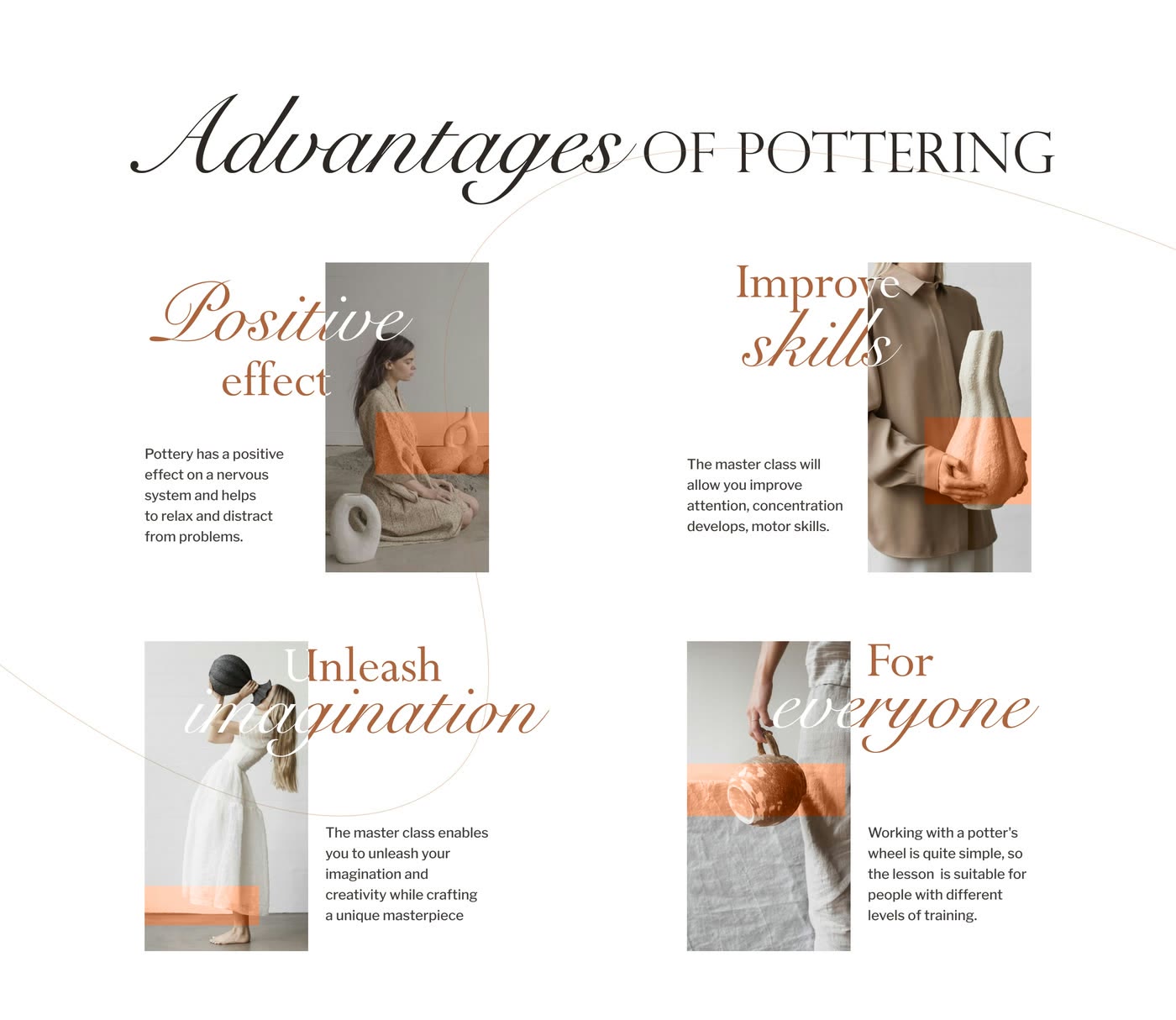
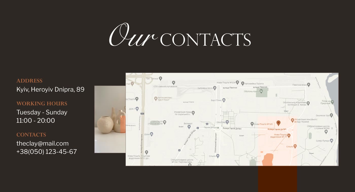
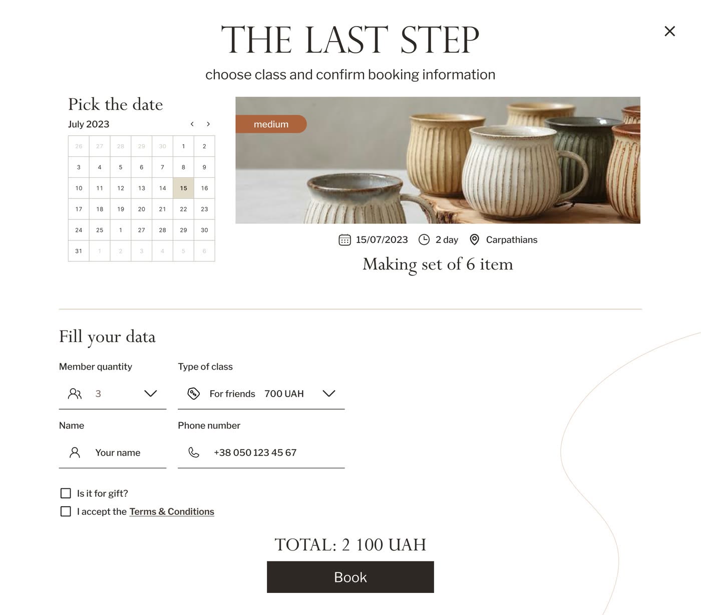
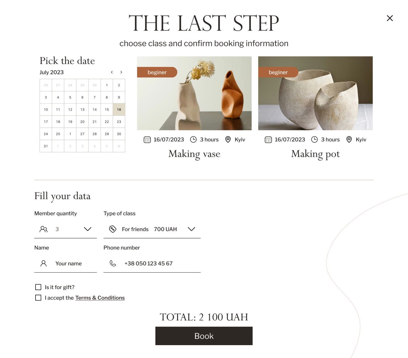
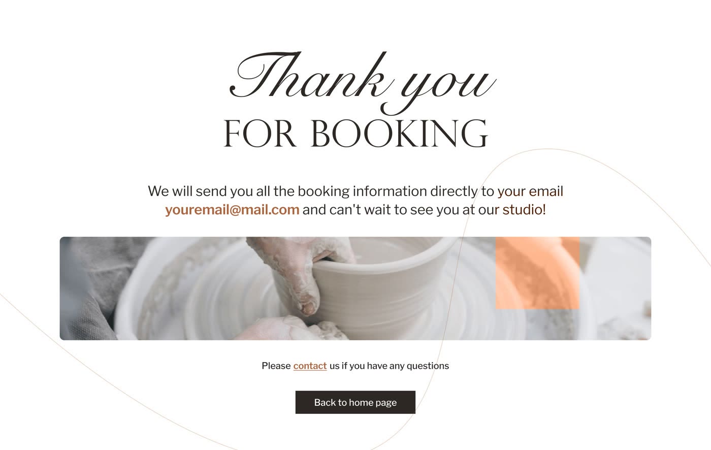
The booking flow in motion
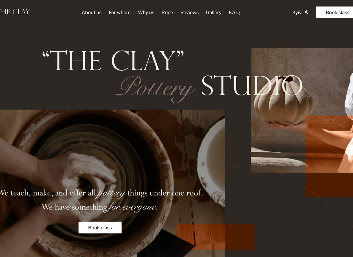
Responsive prototype and handoff
- Studio story to date picker Hero, who it is for, prices, reviews and FAQ in 1 Figma flow, ending in a date picker that carries a class booking through to confirmation.
- A photo-led visual system Clay and terracotta neutrals, Perpetua paired with Libre Franklin, rounded photo-first components on a 12-column grid — UI chrome steps back so glaze and texture carry the colour.
- Booking without a message The date picker takes visitors from class choice to confirmation without waiting for a reply.
What I learned
- The booking flow is the product. Everything above it — story, photography, prices — exists to get someone to a date they are willing to pick.
- Warmth and texture are not decoration here: the interface has to feel like the material it is selling, or the studio reads like any other form.