Playable Offers
50+ in-game offer mechanics across luck, skill and choice — all built on 1 reusable system.
- 50+ offer mechanics on 1 shared system layer
- +30% purchase conversion after simplifying the opening
- +25% further lift after a later redesign, across several games
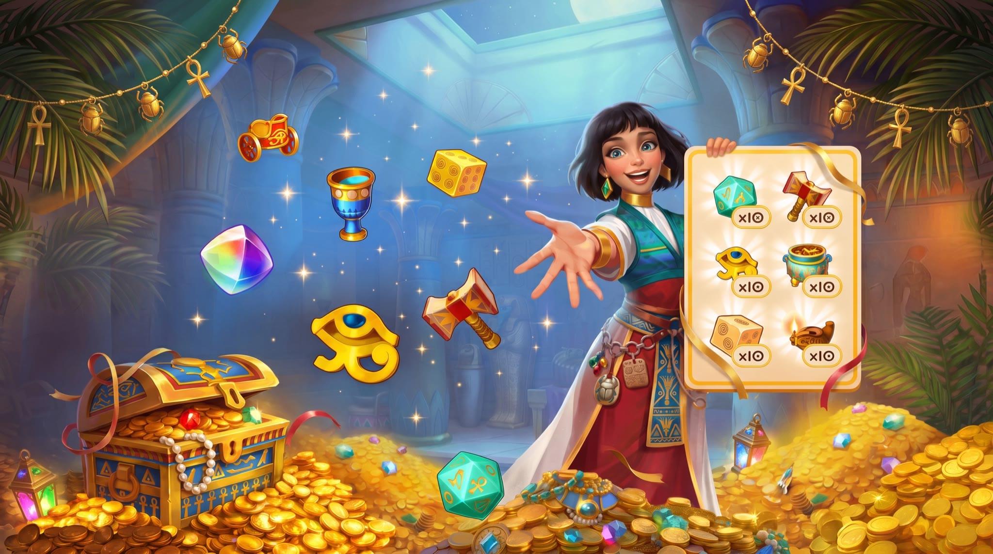

Luck, skill or choice
Every format in the library starts from one question: what does this ask of the player? The answer sets everything downstream — how long the moment lasts, what can honestly be promised, whether the price is allowed to move.
Luck
- A wheel, a slot, a chest, a scratch voucher. One tap and the offer changes. Fast to enter, cheap to build — and it only survives if the odds are on the screen.
Skill
- A plinko board, a rings puzzle, a pair-matching grid, a crowd with one odd cat hidden in it. Slower and more expensive, but the bundle comes out feeling assembled rather than dealt.
Choice
- A 9-item grid, 5 slots to fill, a ladder of discounts bought with crystals. No randomness at all. The player authors the offer; the price stays where it was put.
Fairness before the first tap
I classified each format as luck, skill or choice, then defined what it could promise in return. 2 moments mattered most: the opening second, when an offer looked like an ad, and the reveal, when unexplained randomness felt deceptive. Simplifying the opening was followed by a 30% lift in purchase conversion; a later redesign by a further 25% across several games.
- 01
The reward has to be the offer itself. A wheel that multiplies the bundle already on screen cannot be read as bait; a wheel that pays out something else can.
- 02
4 drops on the Plinko board let players shape the bundle instead of receiving one random result.
- 03
Published odds and a guaranteed floor build more trust than decorative reassurance.
- 04
Rules inside a 30-second offer go unread, so instructions sit on the live board, over the relevant control.
- 05
Running out of currency is a fork, not a dead end. Routing the player to the Bank kept the moment alive instead of ending it on a disabled button.
From producer brief to shared handoff
- Brief — what the producers need the offer to do, what the game already has to sell
- Reference pass — how comparable products solved it, read as a benchmark rather than a mood board
- Decision model — what the mechanic asks of the player: luck, skill or a choice
- Beat map — idle, first action, escalation, reveal, claim, exit
- State map — playing, won, lost, leaving, each one an explicit frame
- Economy contract — what is guaranteed, what is random, what filling the meter buys
- Onboarding — numbered overlays and tutorial cards written into the first play
- Composition — where the eye lands first, what the colour is doing when it gets there
- Layouts — landscape and portrait drawn as 2 compositions, not 1 adaptive frame
- Reskin — palette, decoration and narrator per host game
- Prototype — timed frame sequences that double as the motion spec
- Spec — each mechanic written up for engineering: states, rules, edge cases, what every number does
- Consistency pass — checked every format against the shared system
- Handoff — named states, swap points and the shared system layer
The layout is solved once
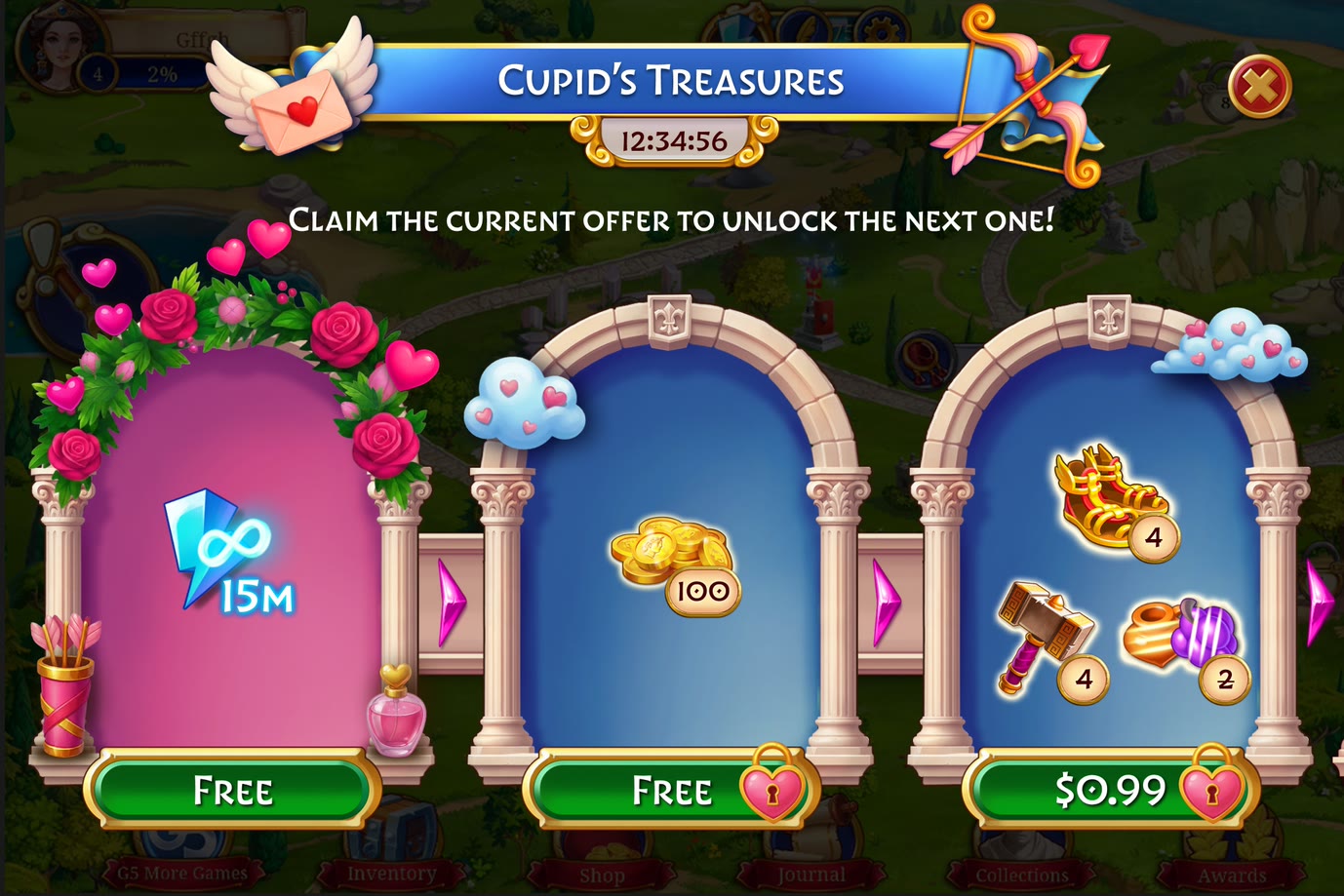
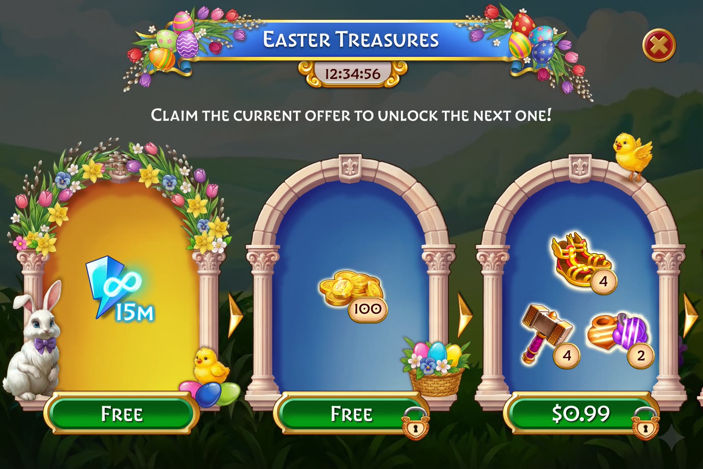
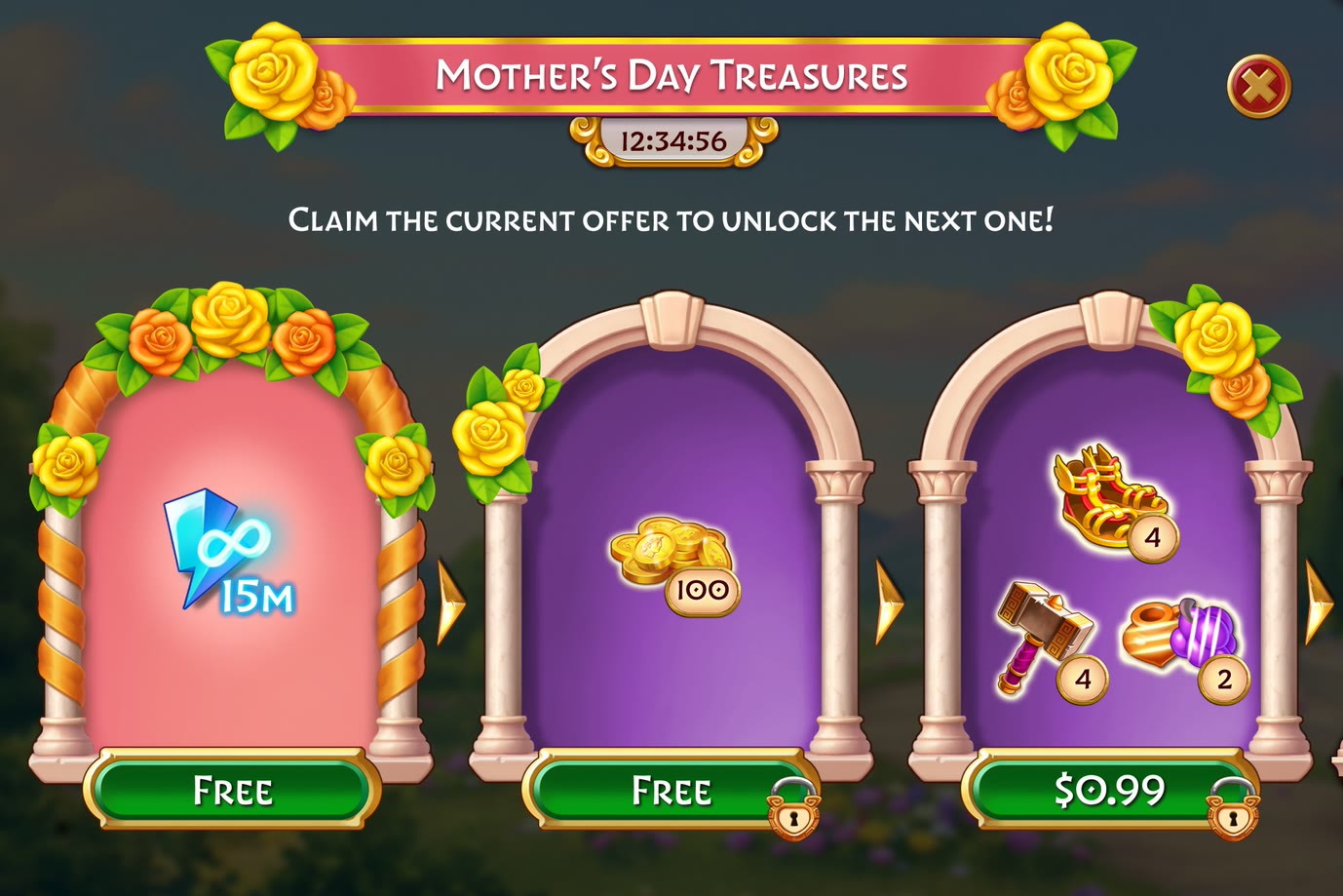
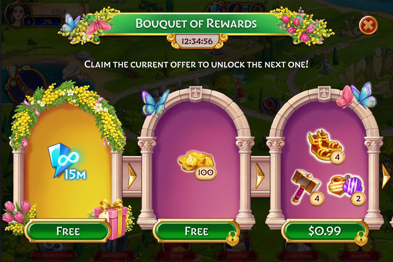
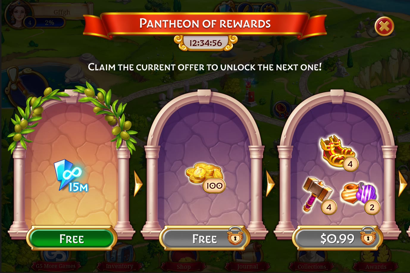
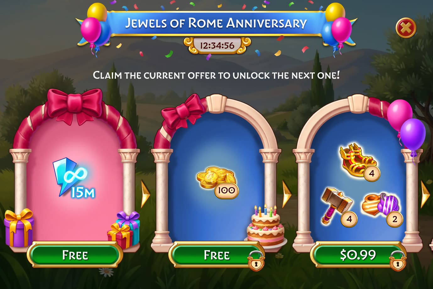
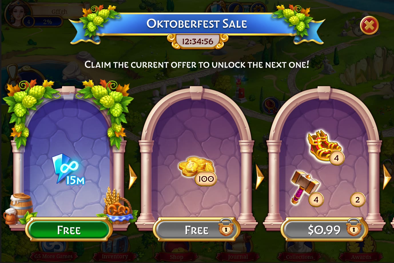
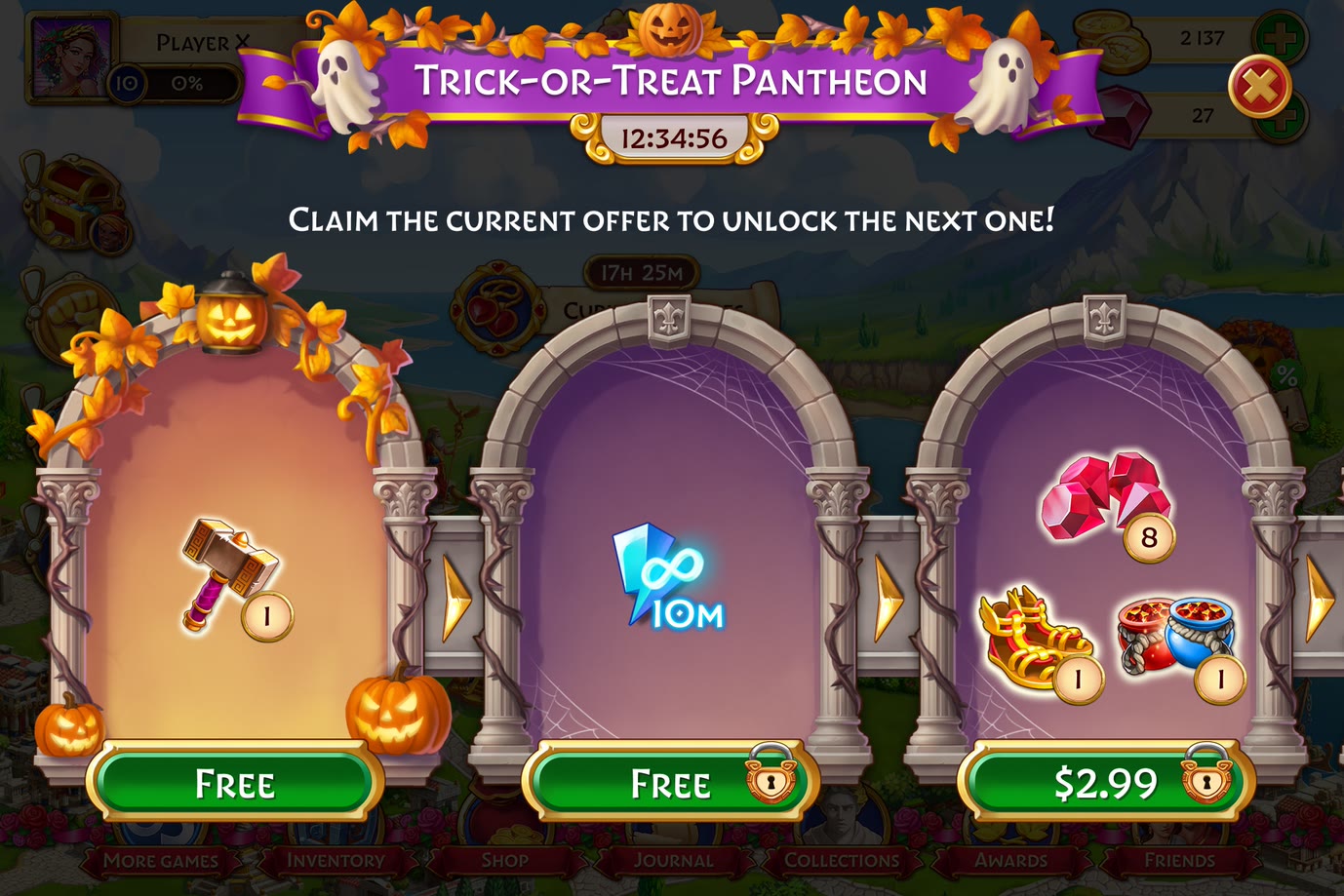
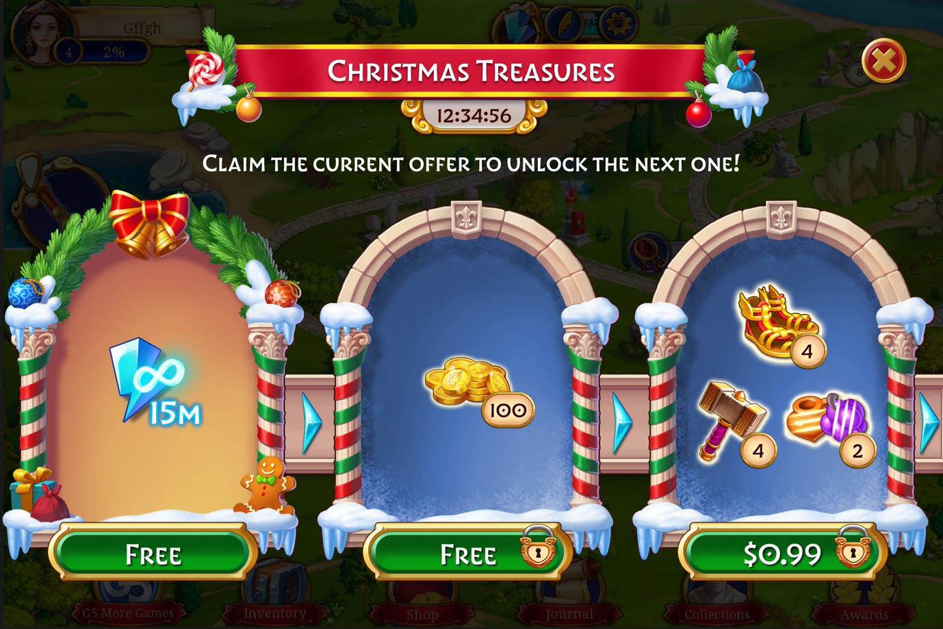
The strongest evidence that this is a system rather than a stack of screens is what happens when the season changes. 3 arches, the same chevrons between them, the same free-free-paid ladder — reskinned as many times as the calendar asks, without the geometry moving. The frame below holds still while those passes cycle through it.
That constraint is what makes a format worth building: the layout is solved once, and every event after it is decoration rather than redesign.
Several games, 1 tutorial
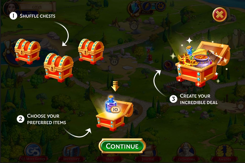
The tutorial rides the board it is describing. A hand points at the exact tile. Numbered steps sit over the live mechanic — turn the card, rotate the ring, drop the coin. Where a beat needs spelling out, a 3-panel card names it before the first tap, then gets out of the way.
The same component sits underneath. Panels, numbers, chevrons and tap-to-continue are shared; each game reskins them and slots in its own mechanic. The onboarding pattern works across several games, so every new format inherits a tutorial instead of starting from scratch.
Every exit names the cost
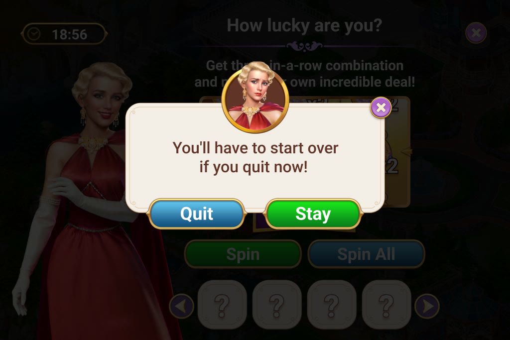
Every mechanic can be abandoned halfway, so every mechanic needs this dialogue — but a generic one wastes the moment. The component is shared; the copy names what leaving costs in that particular mechanic. Where a run resets, it says the items will have to be won again. Where a puzzle restarts, it says the pipes will have to be rotated again. Where nothing is actually lost, it falls back to the plain limited-time line rather than inventing a threat.
A playable is a state machine
The loop stays the same: enter, tutorial, first action, repeat, reveal, then claim or exit. This clip follows one run through the reveal.
3 changes clarified choice, odds and progress
Evidence came from producer briefs, comparable-product reviews and shipped conversion data; this was design evaluation, not a participant study. Each mechanic was checked for an obvious first action, an earned reveal, legible pricing and a clear early-exit cost.
- 01
BeforeA single lane of chained offers
After2 lanes running in parallel — 1 free, 1 paid
Why1 lane forced a choice between giving something away or selling it; 2 lanes let the free track pull players along the paid one without blocking it.
- 02
BeforeA random reward with the odds unstated
AfterEvery outcome labelled with its own percentage, over a guaranteed floor
WhyUnstated odds made a good offer read as a trick. Naming them let the mechanic keep its surprise without spending trust to get it.
- 03
BeforeA horizontal milestone rail under the item grid
AfterA vertical gift meter beside it
WhyUnder the grid the reward read as a footnote. Beside the choices it reads as the thing filling up while items go in.
Mechanics across game worlds
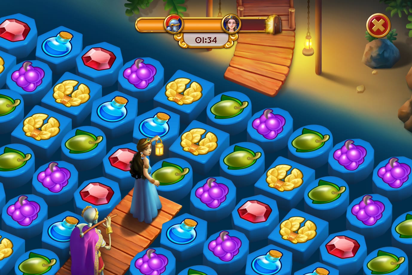
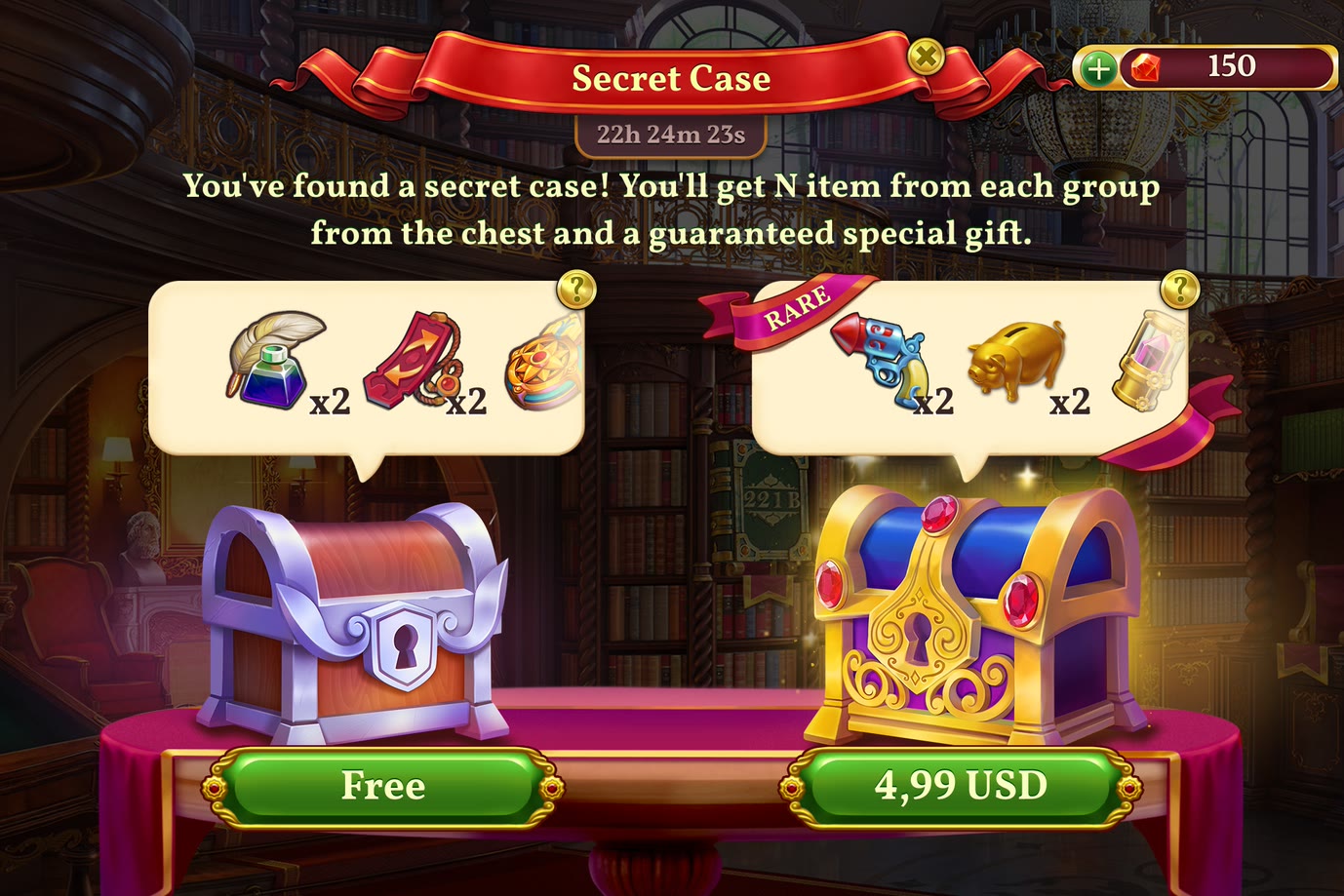
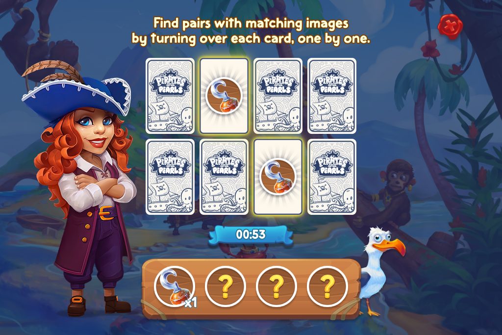
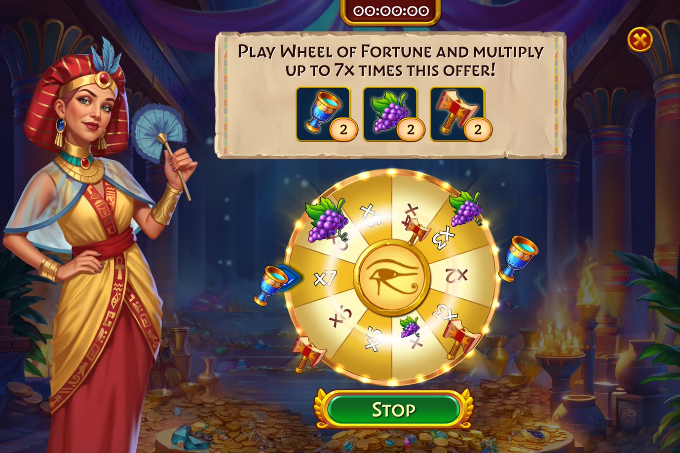
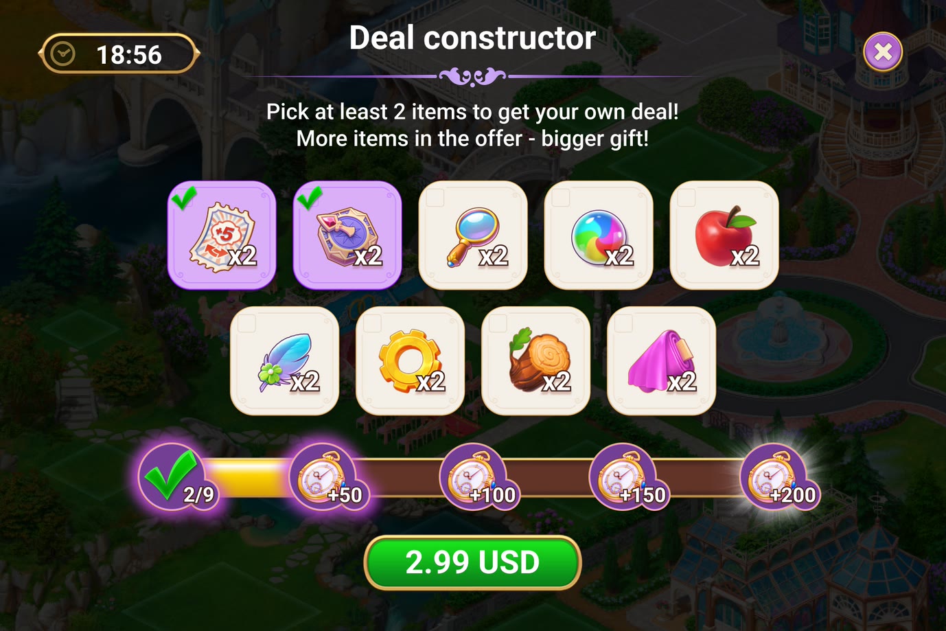
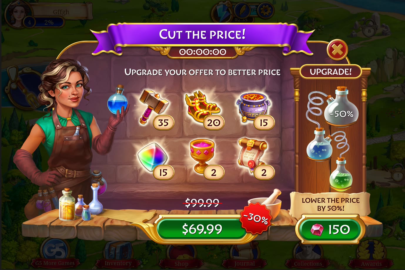
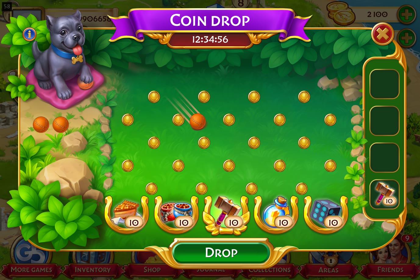
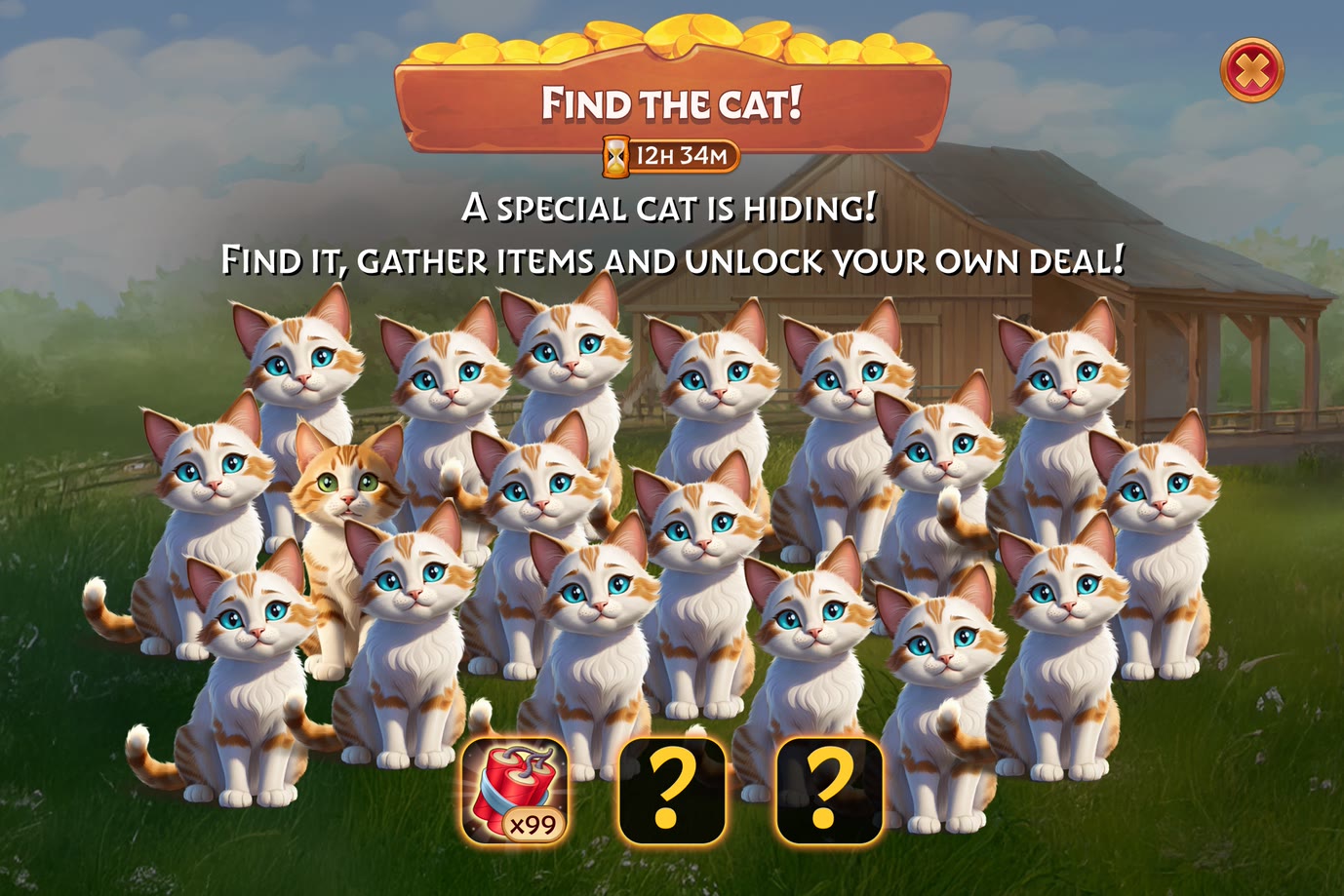
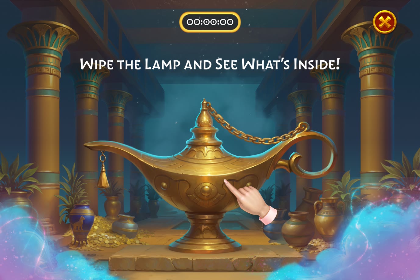
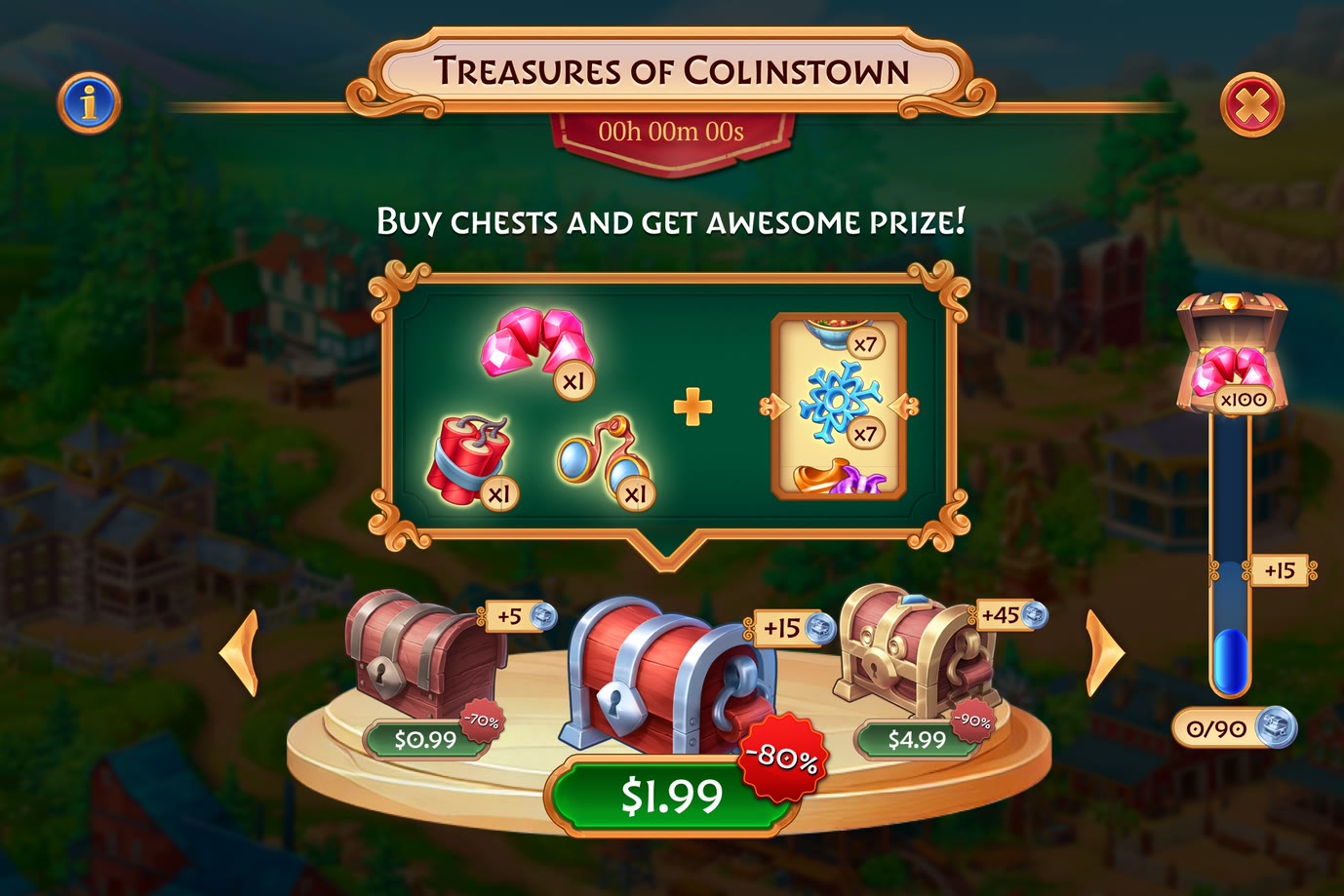
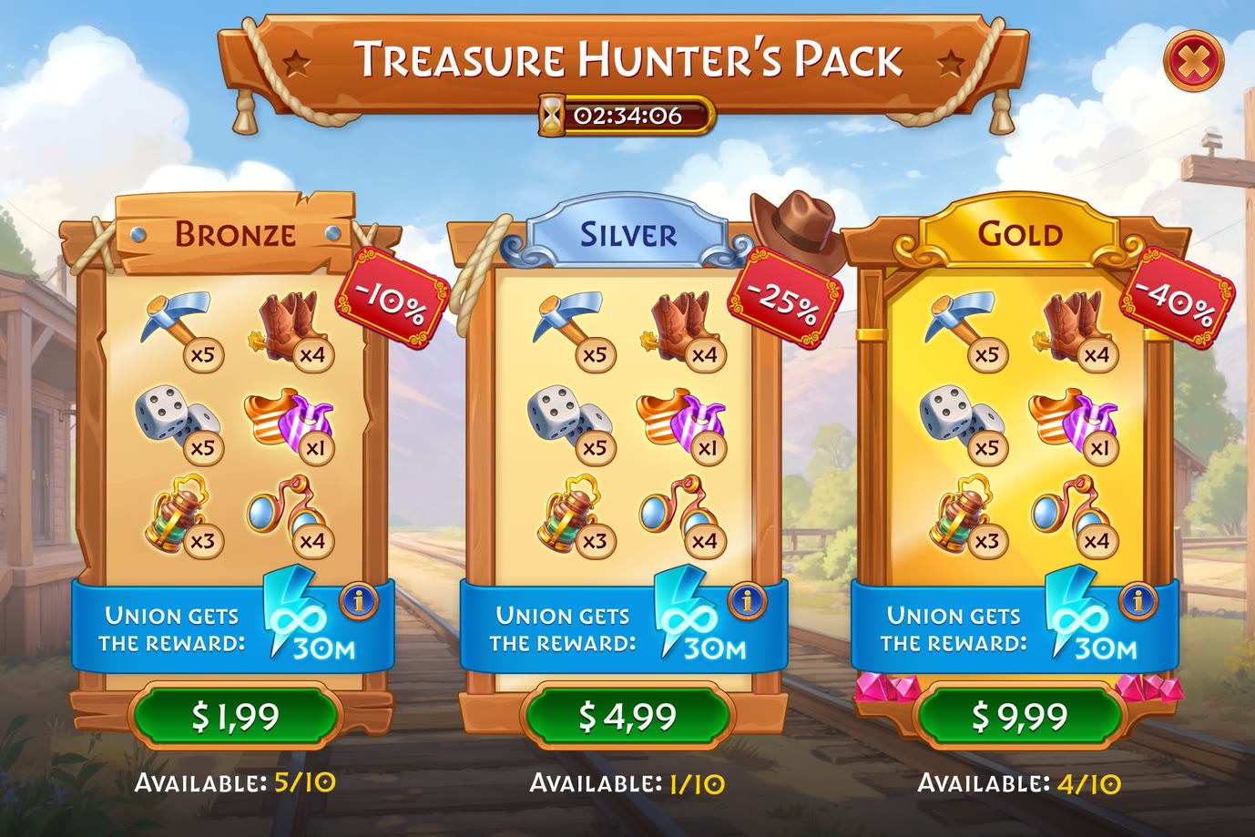
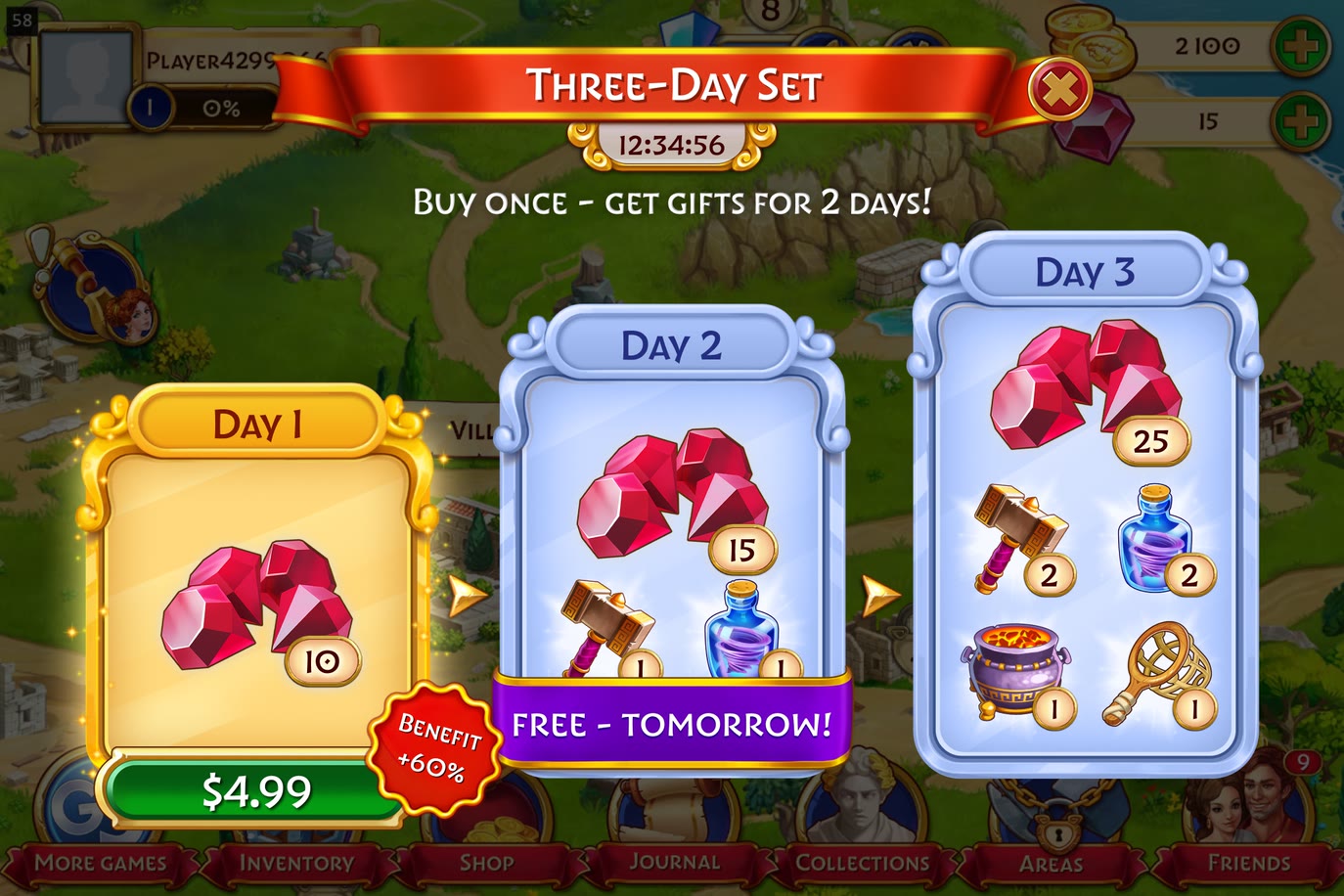
The same system worked across games
- 50+ mechanics From multiplier wheels and Plinko boards to bundle builders and multi-day offers.
- 1 shared system layer Exit dialogue with per-mechanic loss copy, teach-by-doing onboarding, published odds and pity meters, a currency fallback that routes to the Bank, landscape and portrait. Written once, inherited by every format.
- Timed prototypes preserved the feel The prototype doubled as the motion spec, which is why the feel survived the handoff.
What I learned
- A reusable format that works across games beats a perfect screen used once.
- Fairness is a design surface. A pity meter and a published drop table changed how an offer felt more than any amount of polish on the reveal.