Planners organised the day, not the start
I reviewed the planners and ADHD tools used in the exploratory conversations. The pass was directional and the competitor count was not recorded; the repeated gap was clear enough to frame the product.
- Planning
Lists, priorities and calendars were well covered.
- Starting
The transition into work had no dedicated moment.
- Pressure
Streaks and scores could turn support into judgement.
Starting is the product
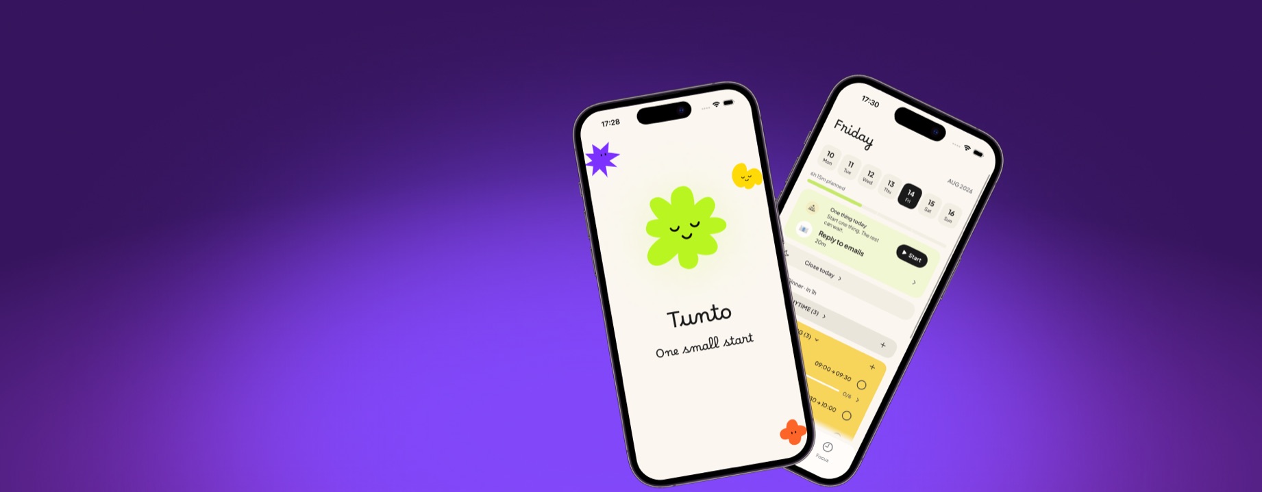
Tunto is a quiet daily planner for the days when the hardest part isn’t finishing a task, but starting it. No “become 10x more productive,” no pressure. Just making that first step a little easier.
A word about the name: Tunto means “feeling” or “sense of touch” in Finnish — and that’s exactly what I wanted the app to be about: not stats and streaks, but how the very start of anything feels.
People needed help starting, not another planner
Tunto began with a pattern I knew firsthand: I could choose a task, make a plan and still spend 20 minutes not starting. Remote creatives and freelancers described the same problem. These were exploratory conversations, not a clinical study, and I did not record a participant count. The apps I reviewed organised the day but did not help with the 5 minutes before work began. That became the brief: help someone start, not build another list.
- 01
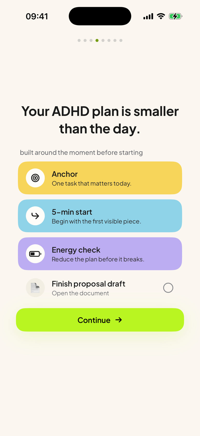
The problem is not the plan. Someone who is stuck often already knows what to do. Tunto helps them begin instead of asking them to organise more.
- 02
Seeing the full list while already overwhelmed adds pressure. Tunto shows one task now and folds the rest away.
- 03
Streaks and scores can turn support into judgement. Reminders are off by default, missed days are never counted and every permission is optional.
Research to a working iOS app
- Exploratory conversations — remote creatives and freelancers who struggle to start tasks, on where the day stalls and what they do about it
- Competitor analysis — what planners and ADHD apps offer in the 5 minutes before starting
- Product definition — framed the job as helping someone begin, not organising the whole day
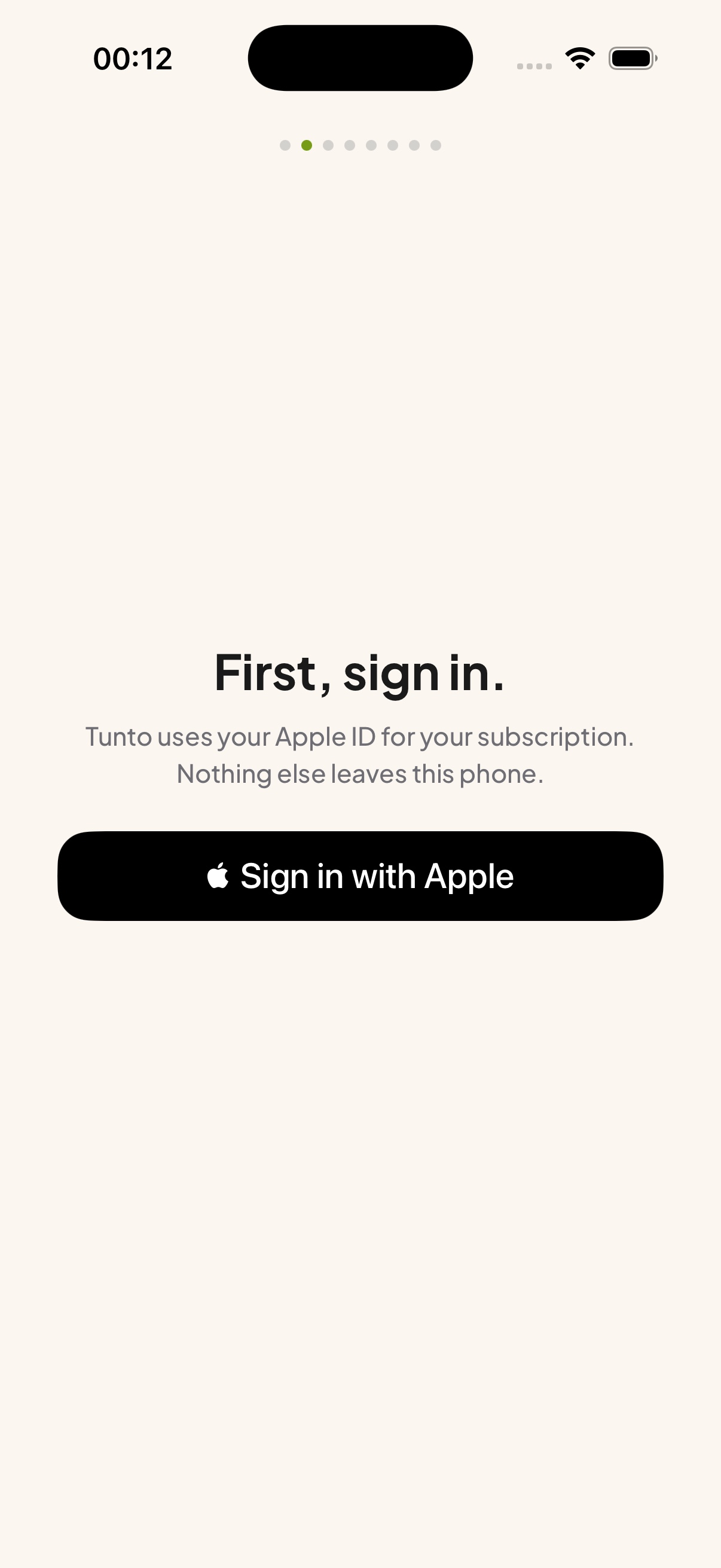
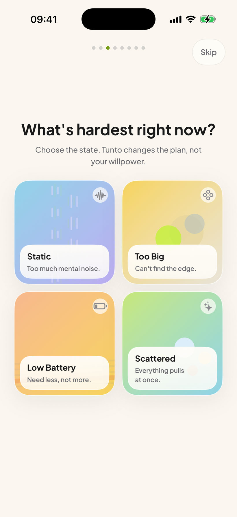
- Flows and states — 8 core flows, 25 screens
- Wireframing — planner, assistant and focus in lo-fi, before a single colour was picked
- Interface design — planner, assistant, focus, task forms, notifications and settings, light and dark
- Character and identity — Tunto the blob, 6 app icons, the colour system the day runs on
- UX writing — every word on screen, from the onboarding questions to the FAQ sheet
- SwiftUI build — the whole app, local-first with no backend, plus a Live Activity and a Today widget
Colour carries the time of day
Time of day is the only grouping in the planner, and colour carries it: warm in the morning, cool by evening, a neutral band for anything with no hour on it.
Lime stays out of that scale. It is the one colour that means act — Start, Continue, the control you are meant to touch.
- #EAE5DA Tasks with no hour — a neutral band outside the day’s rhythm
- #F7D45A Morning tasks — the warmest point in the day’s colour sequence
- #8FD3E8 Afternoon tasks — a cooler cue as the day moves on
- #BCADF2 Evening tasks — the coolest end of the day’s sequence
- #B9F621 The action to take now — Start, Continue and the control meant to be touched
From stuck to a small step
- 01 First launch
- 02 Name what’s hardest
- 03 Empty your head
- 04 One thing today
- 05 Focus session
- 06 Close the day
3 changes made starting easier
I reviewed the working SwiftUI build against one question: once work begins, does the app get out of the way? This was a self-review, not participant testing.
- 01
BeforeOpening on the task list
AfterOpening on a single stuck-entry prompt
WhyA long list could make starting feel harder; the prompt reduces that first decision.
- 02
BeforeA cloud sync backbone
AfterFully local, offline, private by default
WhyThe design prioritised trust and calm over sync; local also made the app faster and quieter.
- 03
BeforeA neutral productivity tone
AfterA blob companion with real personality
WhyThe differentiator is how beginning feels; personality carries that transition without turning it into a score.
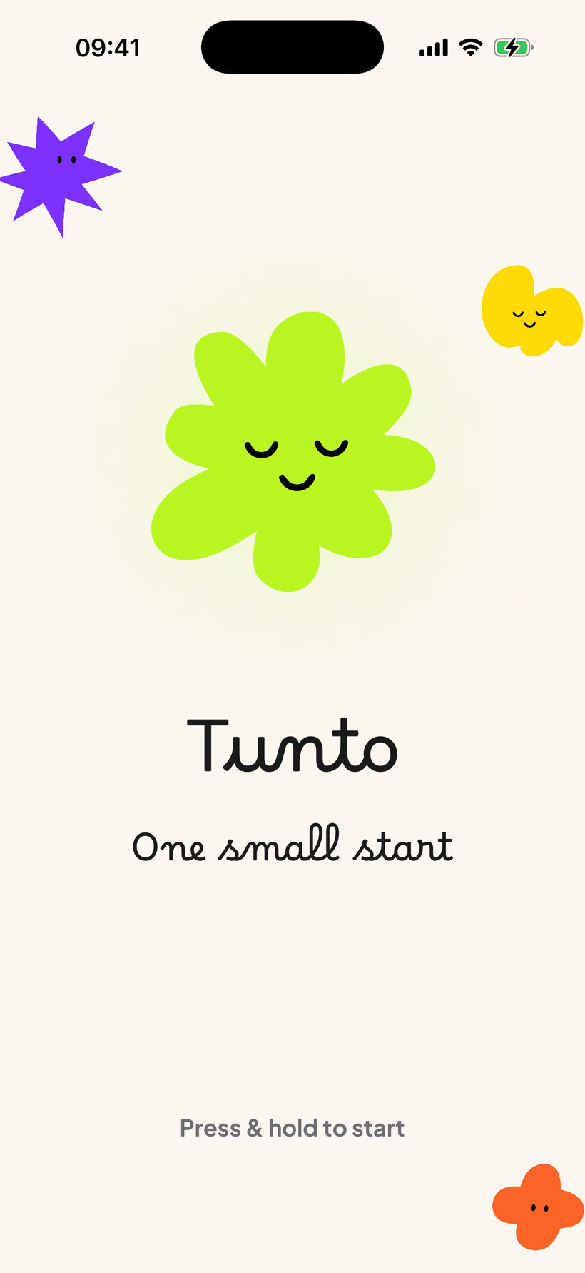
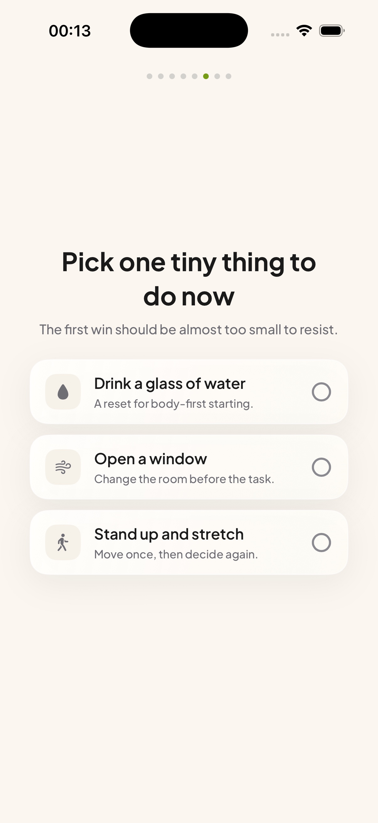
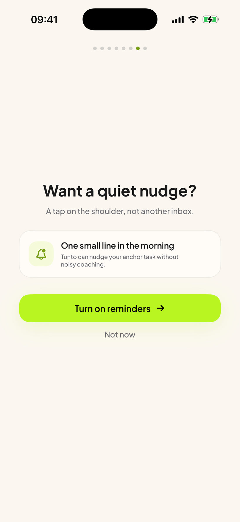
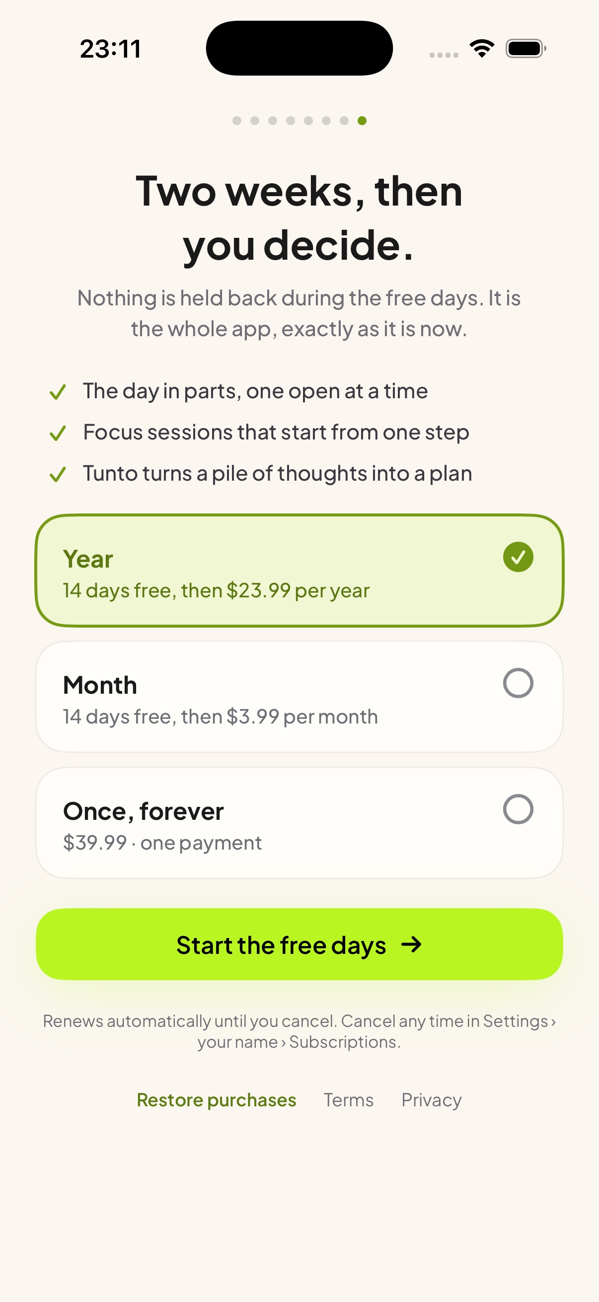
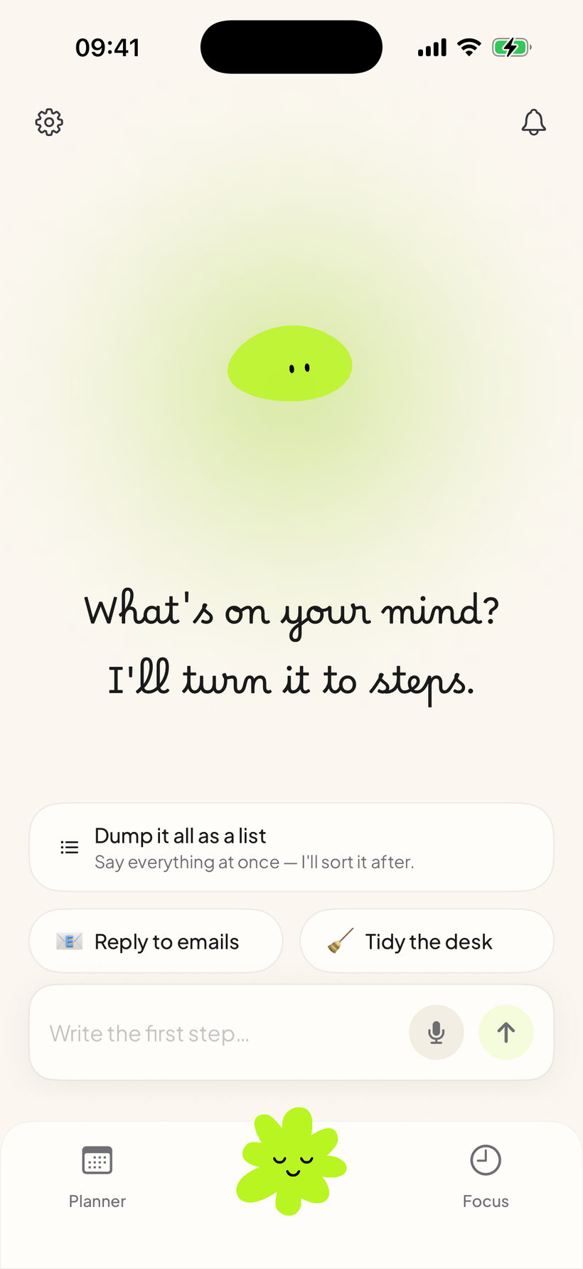
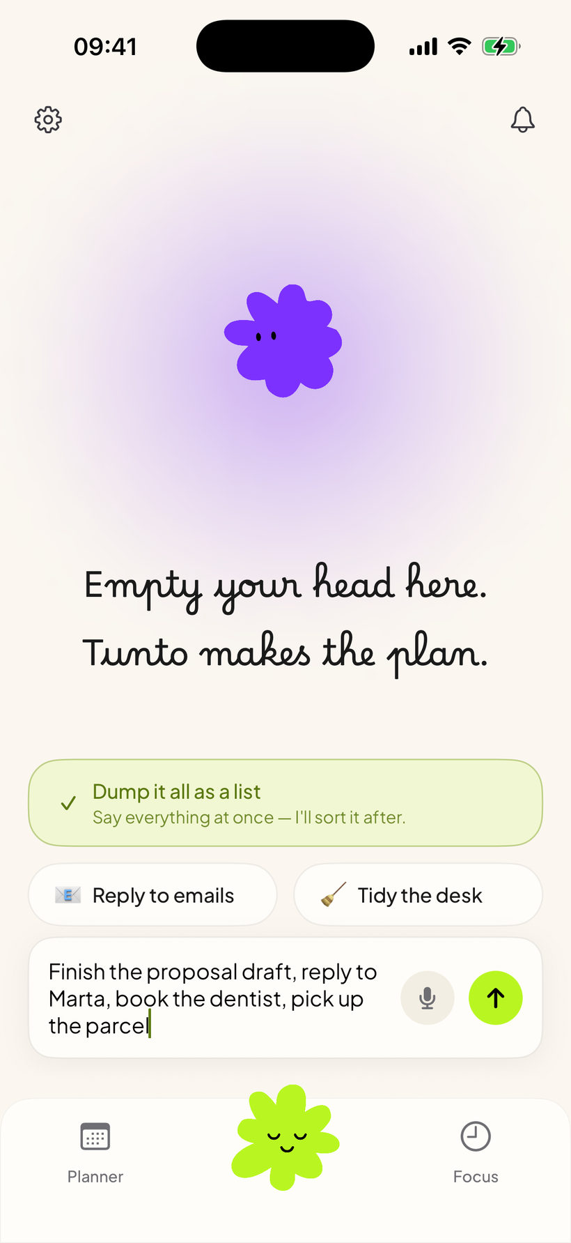
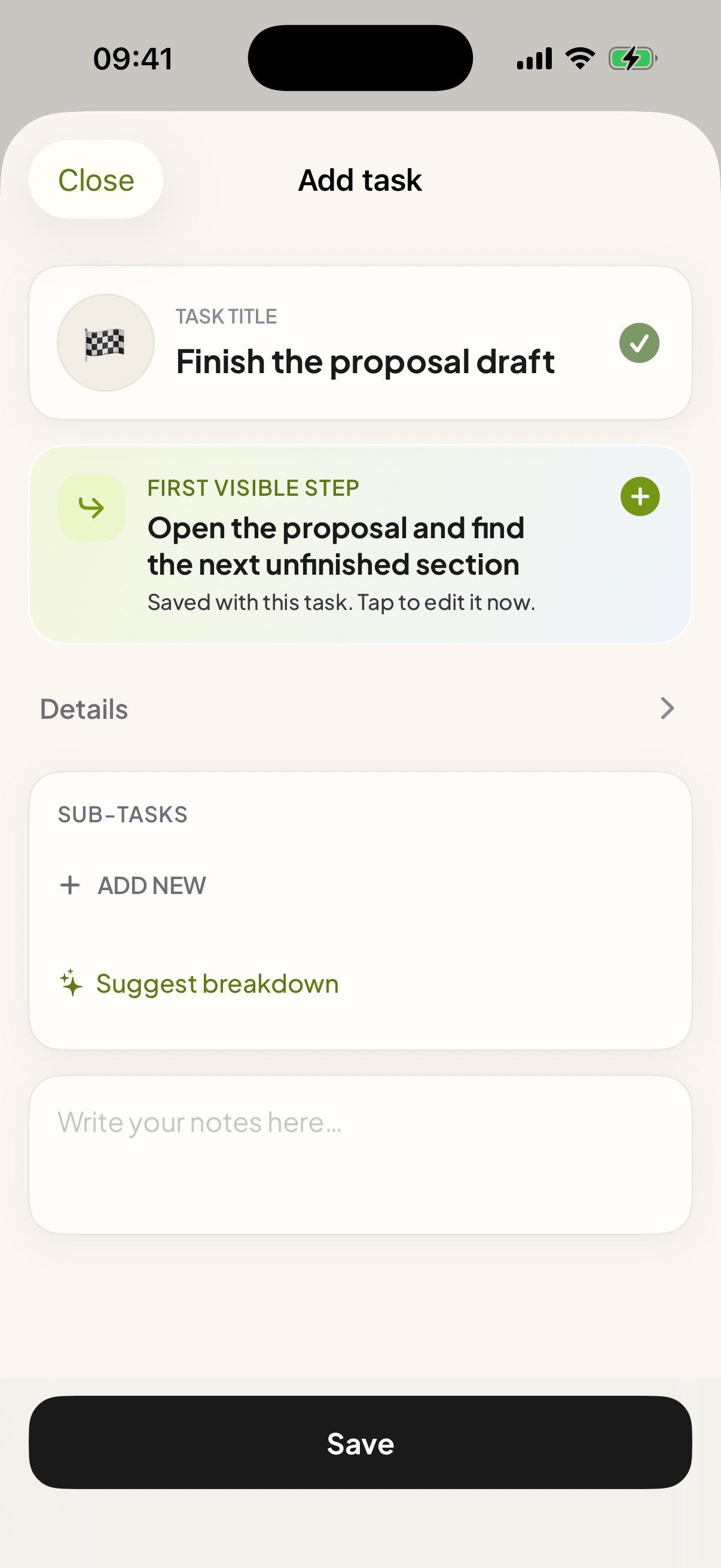
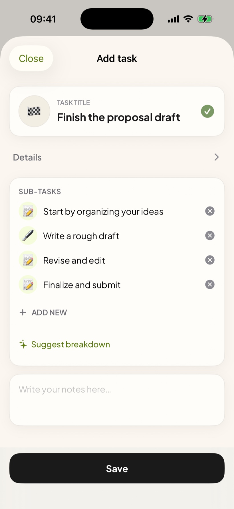
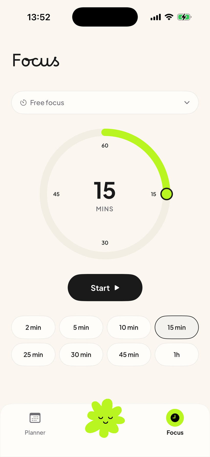
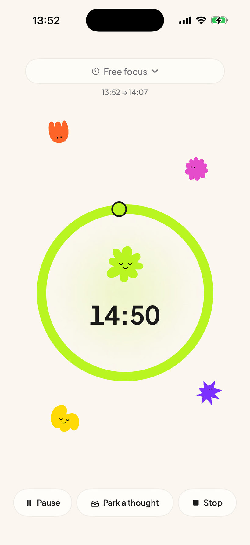
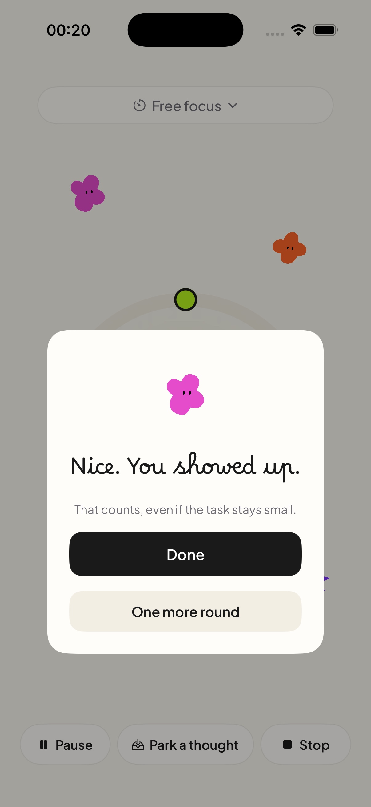
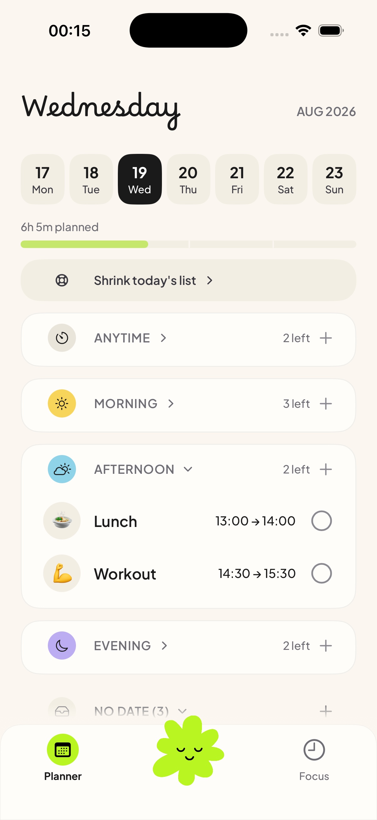
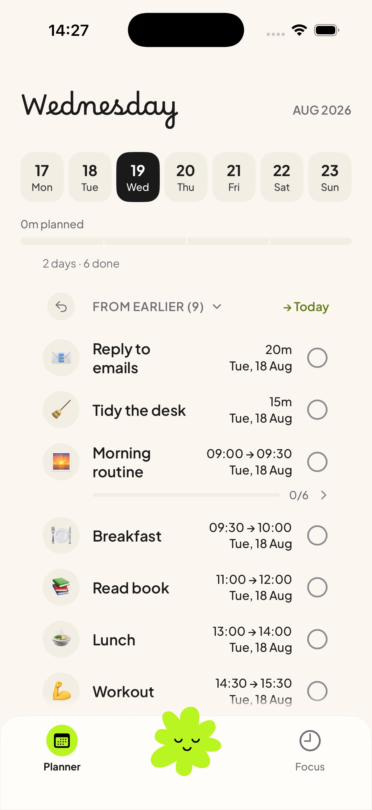
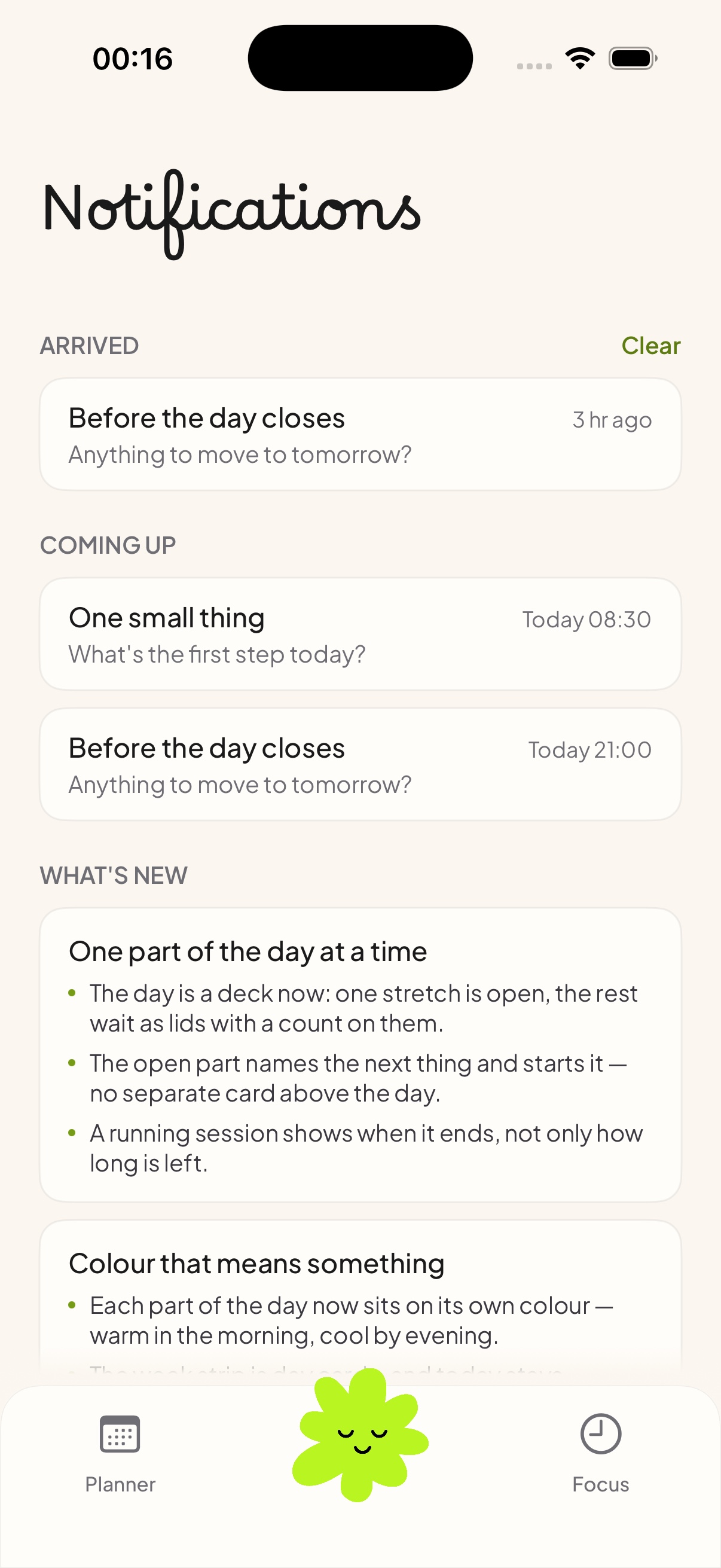
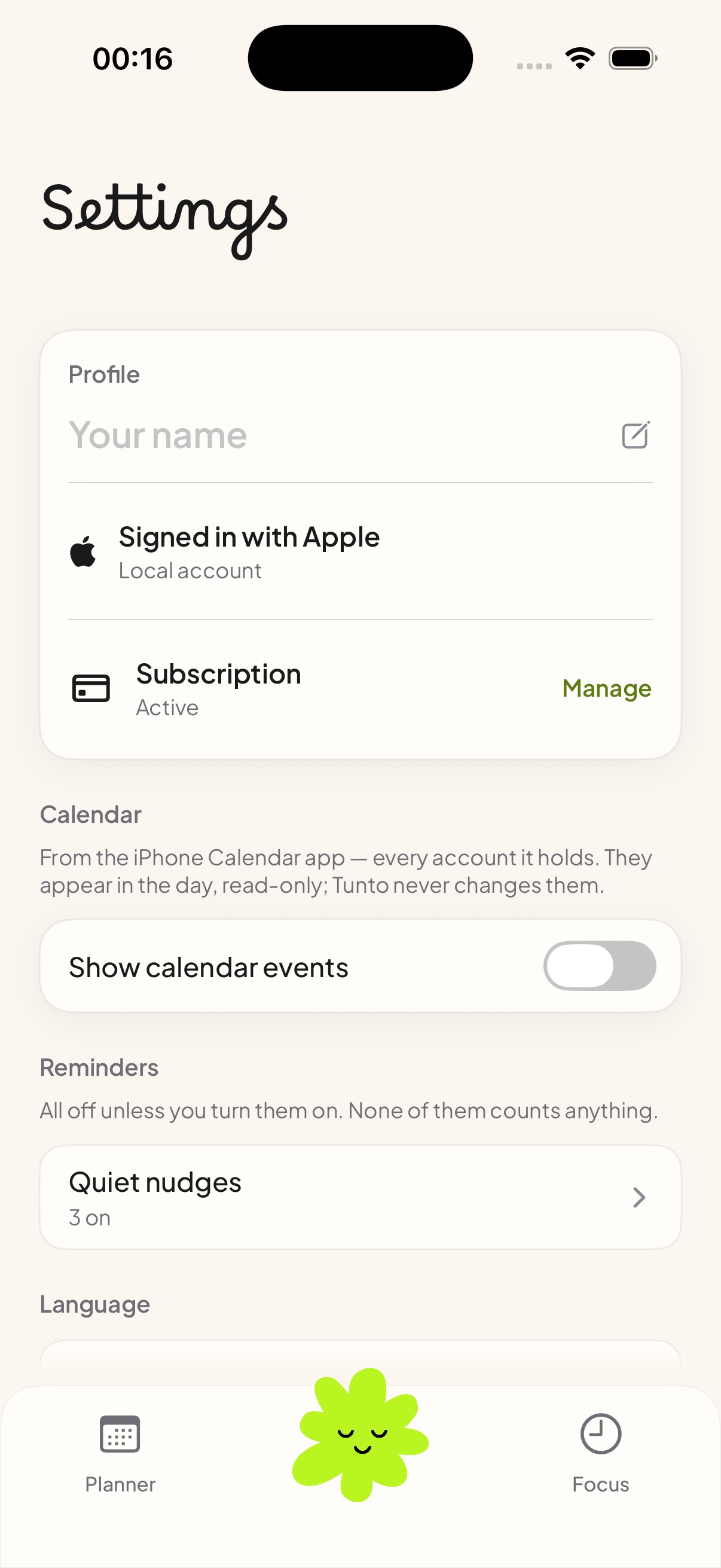
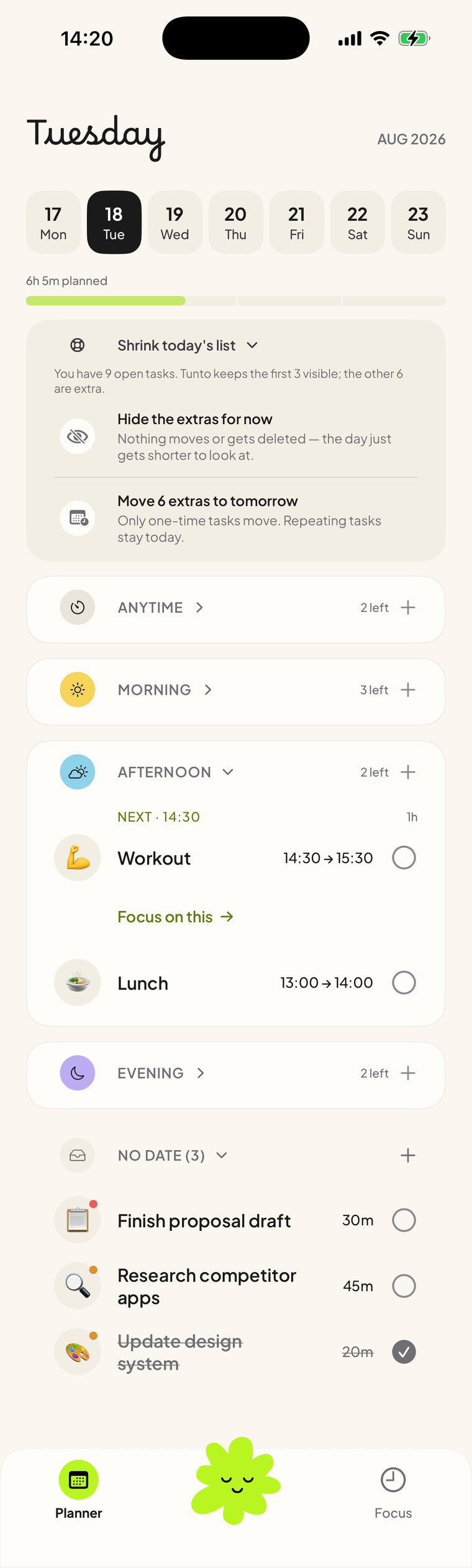
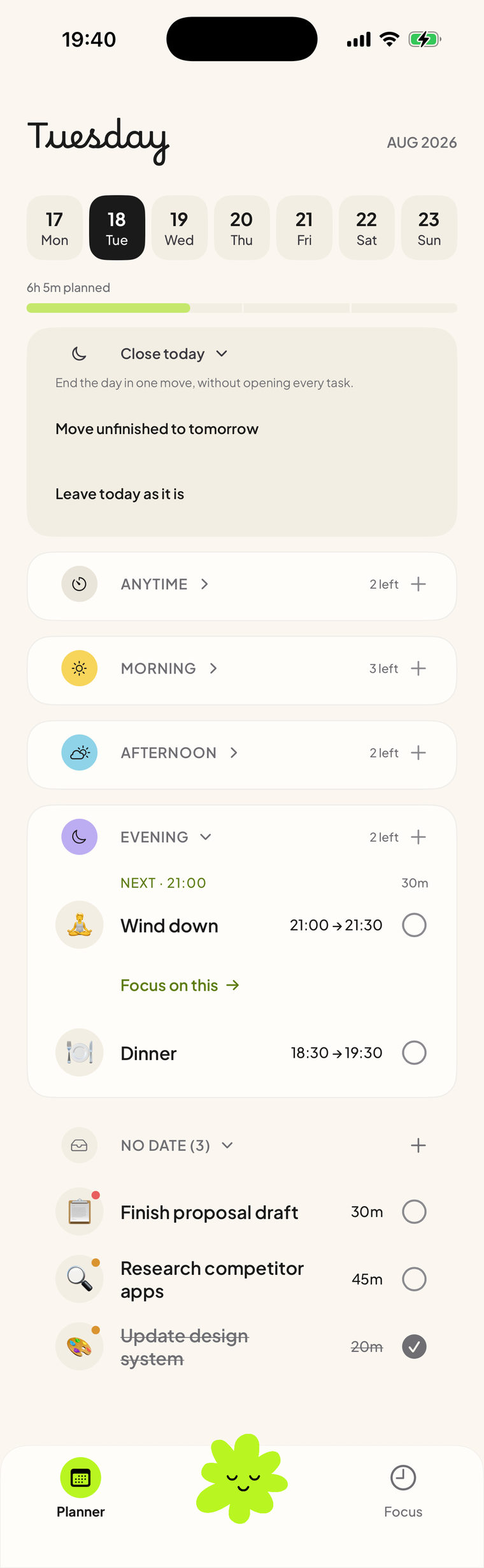
8 core flows, built in SwiftUI
- 25 screens planning, focus and end-of-day review in one app
- Live Activity the focus timer stays visible outside the app
- Full brand a blob mascot, 6 app icons, a colour system
What I learned
- A calmer start mattered more than a longer feature list.
- Building it in SwiftUI exposed problems the mockups missed.