Scale
A learning platform that keeps lessons, homework and mentor feedback in one place.
9 platforms, no complete feedback loop
The benchmark included 9 learning products. Skillshare, Teachable, Canva Design School and Squarespace were the clearest student-side comparisons: all delivered lessons; none kept an assignment, recorded mentor critique, revision and resubmission in one loop.
- Lesson delivery
The category baseline: video, curriculum and progress.
- Deadlines and support
Often split between the platform and chat.
- Recorded critique loop
The gap Scale was designed around.
Feedback and deadlines were missing
I interviewed 1 stakeholder and 1 student, surveyed 1 course cohort and reviewed 9 platforms. The survey sample size was not recorded, so its percentages are directional. The clearest gap was feedback and deadlines, not course content.
“Everything was in different places—so many chats to scroll through. It was chaos.”
“There was no video feedback. We uploaded work as a PDF and received comments.”
- 01
73% linked progress tracking to motivation; 67% needed visible deadlines. Both belong on the first screen, not inside a course.
- 02
Only 10% objected to peers seeing their homework, supporting a shared “Students’ work” tab.
- 03
When a technical problem occurs, 47% contact their mentor before support, so the mentor and group chat remain available on every screen.
Research to a tested prototype
- Research — 1 stakeholder interview, 1 student interview, 1 survey, 9 competitors and a Skillshare heuristic review
- Synthesis — affinity mapping, 11 personas, user stories, a sitemap and a research report with 5 findings and the features each supported
- Architecture — roles, navigation, 19 wireframes across 4 screen types
- Testing — a Maze study over 2 paths with 13 participants
- Interface — 5 screens in hi-fi, including the review loop and both of its waiting states, prototyped in Figma
- System — a component frame, icons, 7 colour ramps
The lesson had 4 jobs
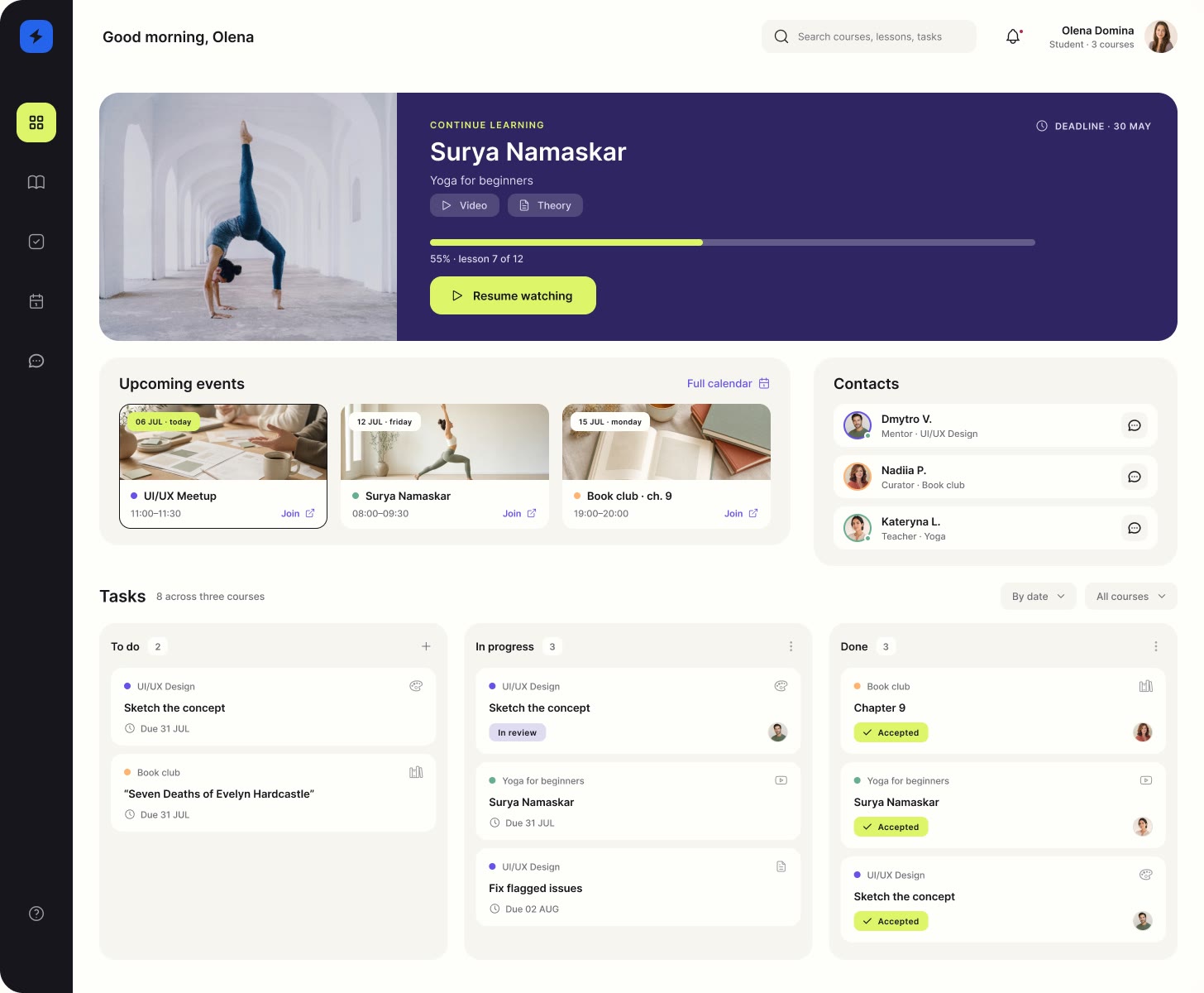
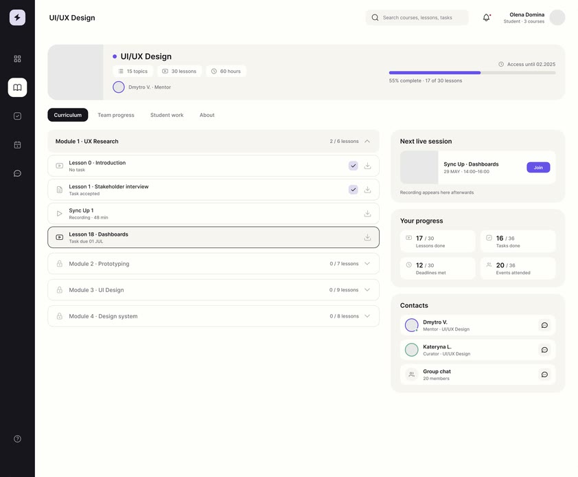
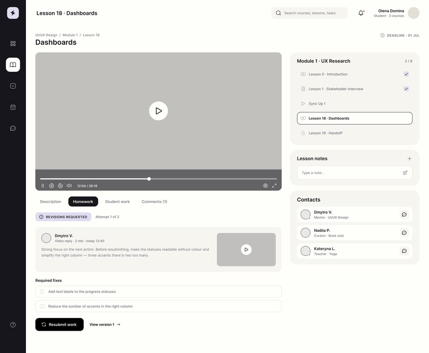
The lesson needed the most work because it combines video, brief, submission and mentor feedback on 1 page. Earlier sketches also moved the calendar off the dashboard and into the navigation.
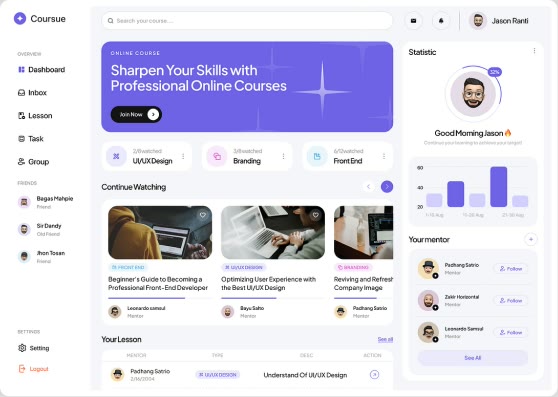
A reading surface, not a control panel
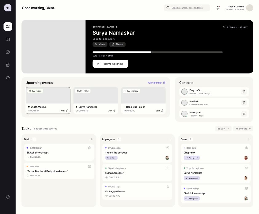
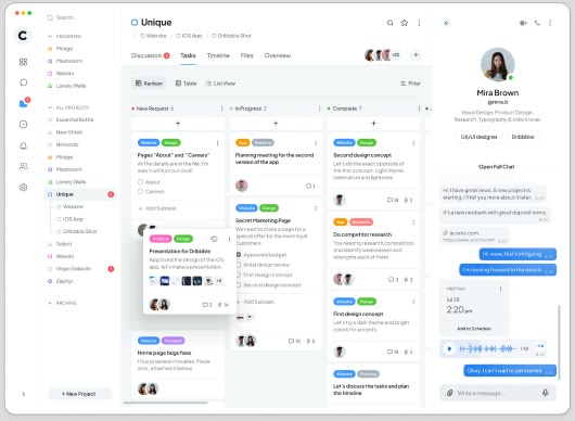
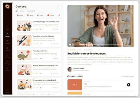
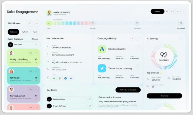
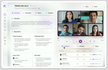
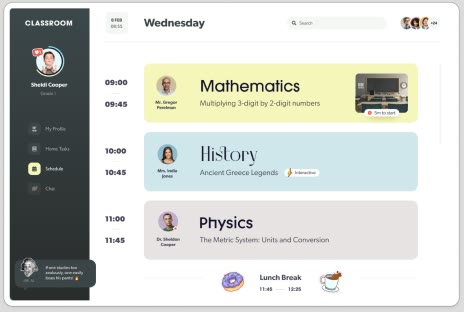
The references point to soft greys and white, rounded corners and generous spacing — a reading surface rather than a dense control panel, so attention stays on the content and the next action.

Colour identifies each course
Each course carries its own hue, applied to the progress bar on its card, the dots down the curriculum, the mentor’s avatar and the outline on the active lesson.
Where a student holds several courses at once, colour identifies the course before the label is read. Every hue is taken from the state ramps, so the coding does not become a second palette.
- #F7F5F1 The page, warmer than the cards it holds so a screen full of them never glares
- #FFFEFB Every card and panel, one shade up from the page
- #17151D Text — and the navigation rail that runs down the left of every screen
- #6652E8 The interface primary — links, active navigation and selected states
- #DDF56A The one action a screen is asking for — never a second
- #302563 The dark card at the top of the dashboard, so the lesson to resume is the first thing seen
- #67AF91 One course — its progress bar, its dots down the curriculum, its mentor’s avatar
- #FEB273 Another course, so a student holding several never has to read a label to tell them apart
- #B62651 Overdue — the one state that has to be read before the course it sits on
- 13 users in the Maze usability test
- 2 core paths 1 direct, 1 indirect
- 0% misclicks after the dashboard on both paths
3 fixes clarified the next step
A Maze study across 2 paths with 13 participants found 41.7% and 83.8% dashboard misclick rates. Every destination screen scored 0%. A Skillshare heuristic review ran alongside.
- 01
BeforeA dashboard you navigated away from
AfterA dashboard that carries the next action
WhyMaze recorded 41.7–83.8% misclick rates on the dashboard, while every destination screen recorded 0%. The redesign introduced 1 clear primary action and reduced the rail to icons.
- 02
BeforeA full-width sidebar with labels
AfterAn icon rail on every screen
WhyIt started as a labelled sidebar that collapsed only where a page ran 3 vertical bands. The later pass made the rail permanent: once every screen carries a working column beside the content, a labelled sidebar is width spent on navigation nobody rereads.
- 03
BeforeA lesson that ended at a message box
AfterA persistent “Mark complete → Next lesson”
WhyBenchmarking against Canva’s lesson page showed the gap. Without a completion action a student cannot close a lesson — and the progress bar in the header has nothing to advance it.